An app your customer gets.
People often judge a device by what they see on their phone. We design mobile apps and web tools that people can use without asking for help, and before the first screen we find out who will use them and why.
Even a good product leaves a bad impression if its app makes no sense.
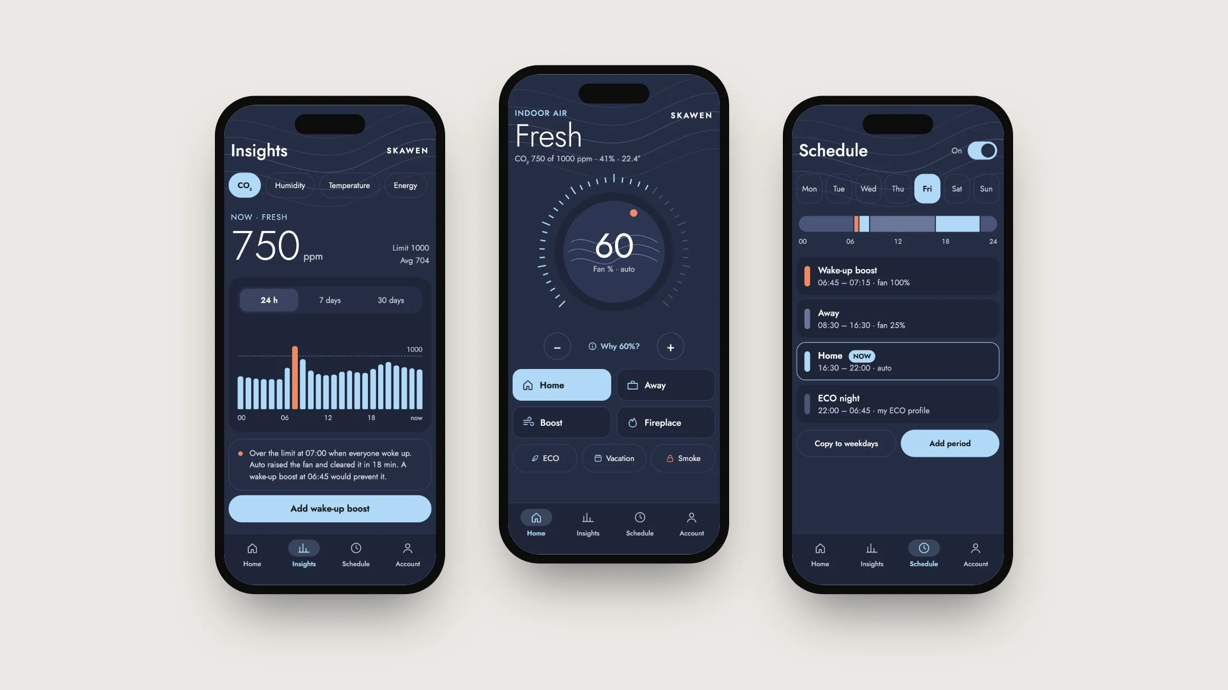
Skawen's ventilation unit measures carbon dioxide, humidity and temperature in the room and adjusts the air exchange by itself. We made the first version of the app for Skawen in 2022, and it let you control the unit like a remote. The home screen greeted the user with “Hi, Welcome!”, but left unanswered the one question they actually cared about: is the air all right?
When the app does not answer that question, people pick up the phone and call the installer. The more clearly the app speaks, the less often that happens. That is how a new version got started in 2026.
The answer first, the buttons after.
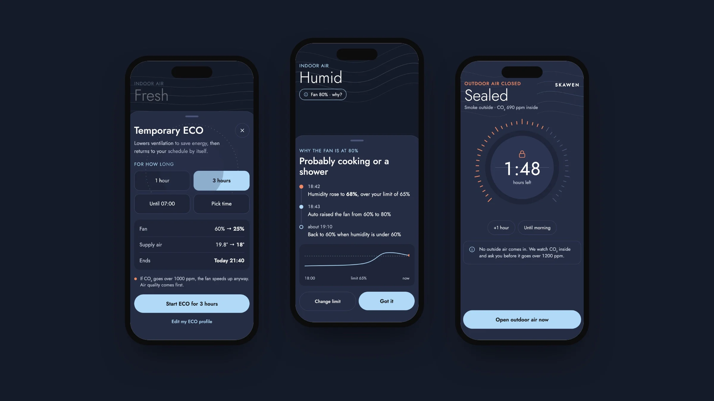
On the new app's home screen, the largest thing is a single word that tells you whether the air in the room is fine. Below it is a sentence explaining why the unit is working the way it is right now, for example why the fan is running at 80% power. And when there is smoke outside, you can close the outside air intake with one tap.
The same app has its own view for the installer, who often works on sites with no internet. That view talks to the unit over Bluetooth and guides the installer through seven steps to start it up, so no paper manual is needed.
Open the interactive presentation ↗ (opens in a new window)First we research, then we design.
- 01
Review of the current app
We start with what already exists. We go through the current app and write down what works, what does not, and which questions the user is left alone with.
List of problems - 02
Competitor research
Next we look at how other manufacturers deal with the same problem. What interests us most is what none of them offer yet.
Comparison table - 03
Choice of features
We write down every proposal and note who it is for and why. For the first version we choose the ones that help users manage on their own. Extras that only impress can wait for a later stage.
Features by stage - 04
Visual direction
Only when it is clear what the app has to do do we get to what it will look like. We create several design directions based on your brand and choose one together.
Approved style - 05
Screen design
We design every view, including the ones usually left out of presentations: error messages, empty screens and warnings. These are exactly the places where people need the app's help the most.
Figma files - 06
Review
Before the screens go to the developer, we go through them as critically as if someone else had made them.
Corrections - 07
Prototype and handover
Finally comes a clickable prototype and a design system, which the developer uses to build the app.
Prototype and design system
Everything a developer needs to build the app.
User research
Who uses the app, what they expect from it and where they get stuck today.
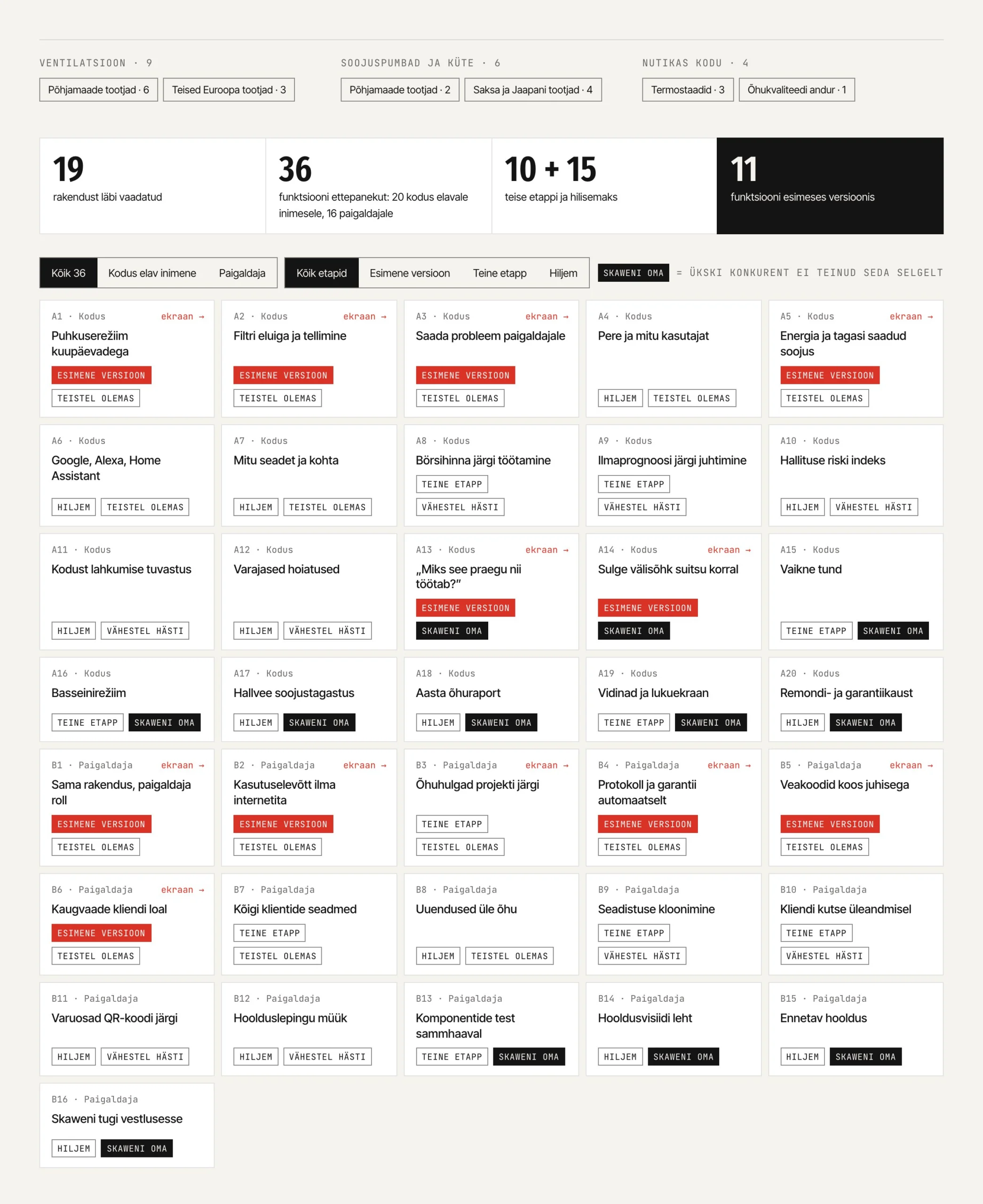
Feature list
Features are split into stages, and each one comes with a note on why it is needed.
User interface
Every screen and view in Figma, whether the app is meant for iOS, Android or the web.
Design system
Colours, text styles, buttons, spacing and accessibility rules in one place, so the developer does not have to guess anything.
Clickable prototype
You can test it with users or show it to an investor or a customer before development begins.
When the product is good, but the app falls short of it.
- You have a device or a service that customers control from their phone.
- Your customer support gets questions the app should be answering itself.
- You are building a new tool and want the design ready before development starts.
Depends on the number of screens and on whether user research is needed. Our hourly rate is €100.
From the first meeting to the clickable prototype.
What people often ask us.
Do you also build the app?
Our work is the app design and the clickable prototype. If you also want the finished app, it is built by our partners, who are developers. If you have your own developer, we hand the design and the design system over to them.
Does the app have to exist already?
No. If there is an app, we start by reviewing it. If there is not, we start with who is going to use the app and what they need.
Do you sign a non-disclosure agreement?
Yes. Product development is often confidential, so we do not show the work to anyone without your permission.
Will the app match our brand?
Yes, because the design starts from your brand. In the Skawen app, the outline lines of the brand became airflow lines that move across the screen faster the harder the fan blows.
Let's talk about your app.
Let's spend half an hour talking about your product and the people who use it. The conversation is free and does not commit you to anything.