AVL Living
AVL Living is a construction and development company from Jõhvi that builds houses, renovates flats and lays floors all over Estonia. The work is done by local, experienced builders, yet nothing about the way the company looked told you so. Our task was to create a brand for them, together with everything it needs to last for years and add value to the company.
Starting point
Holdum OÜ was founded in 2015. Since then the company has built more than ten houses and renovated over a hundred flats. The work is done by men who often live in the same area and drive past the houses they built themselves every day. There was plenty of finished work to show, but the company’s image did not show it.
When we first met, they had a Holdum logo, but there was no brand and no story behind it. Every printed piece had been made at a different time by a different person, and each had its own colour and style. The website was one long page that left you unsure what the company actually did. In 2026 the company decided to present itself better and created a separate three-letter brand for it, AVL. The word Living was added so that it would be clear straight away what the company does. Our task was to bring all of this together under one name and one face.
Logo
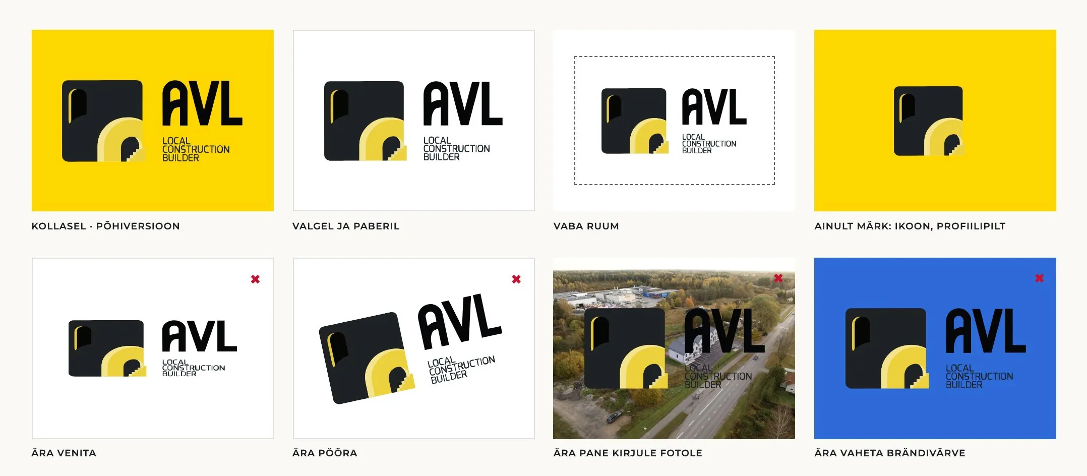
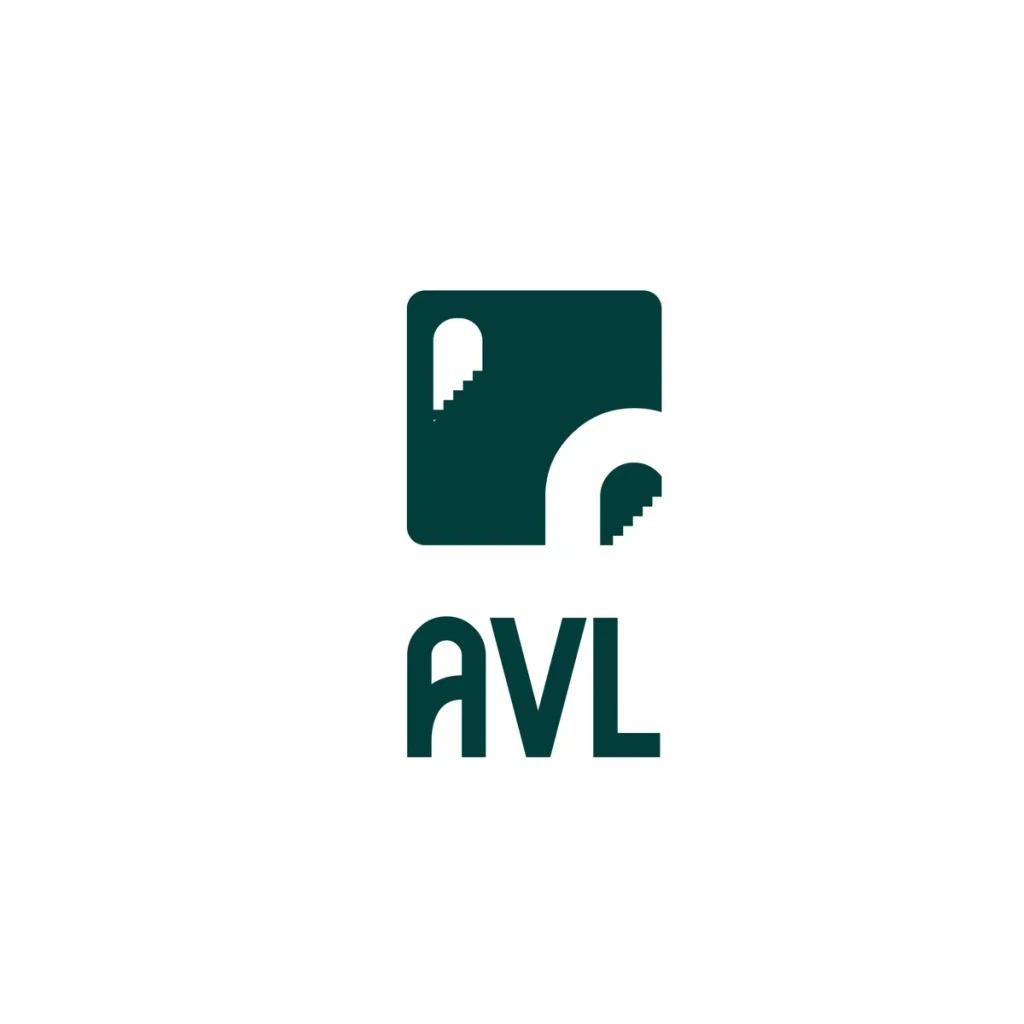
The first step was the logo. The AVL mark is the facade of a house. At the top left there is an arched window with light shining from its edge. At the bottom right there is a yellow doorway with a staircase inside, leading up to the first or second floor. These are exactly the kind of houses AVL builds: homes that people come to live in.
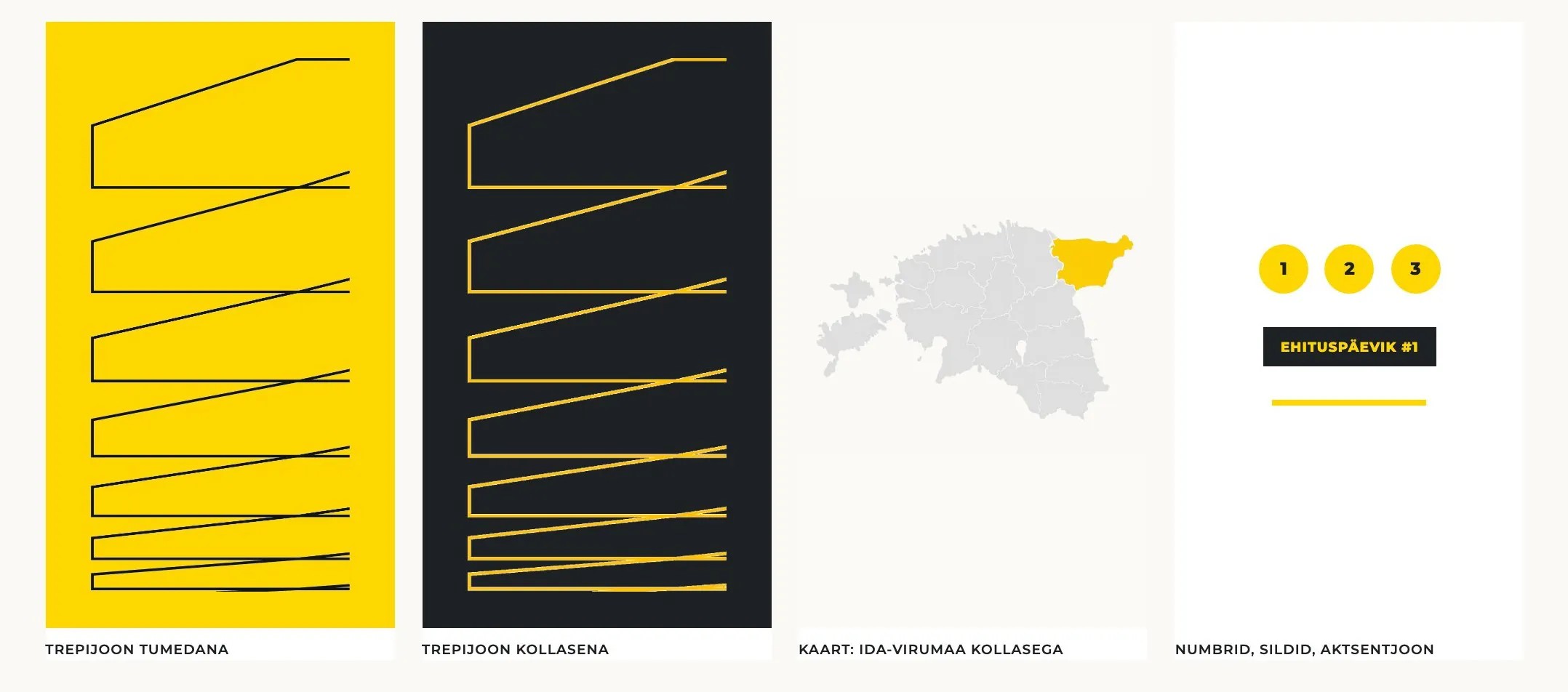
Next to the mark are the words “Local construction builder”. The houses are built by local, experienced builders. For AVL this mattered more than anything else, and it had to be visible in the logo itself. The staircase did not stay inside the mark either. We repeat its steps across the brand as a stair line that runs along the edges of brochures, banners and the website.
Logo drafts
Colours and typeface
The colours came from the logo as well. AVL’s main colour is yellow, the same light that shines from the window and the doorway in the logo. We use it sparingly: on buttons, on building site boards and on a single word in a headline. The other surfaces are dark or light so that the yellow always catches the eye.
Choosing the typeface brought its own challenge. AVL talks to its clients in Estonian and Russian, and all materials have to look the same in both languages. That is why we chose Montserrat, which also includes Cyrillic letters.
Yellow, dark and paper
R 255 · G 215 · B 0 AVL yellow
R 30 · G 33 · B 36 AVL dark
R 250 · G 249 · B 246 AVL white
Montserrat
Regular 400 · SemiBold 600 · ExtraBold 800
If you build, build it properly.
Aa Õõ Ää Öö Üü Šš Žž · Бб Жж Щщ · 0123456789
The headline is set in a regular weight, and only the last word is bold.
Building site
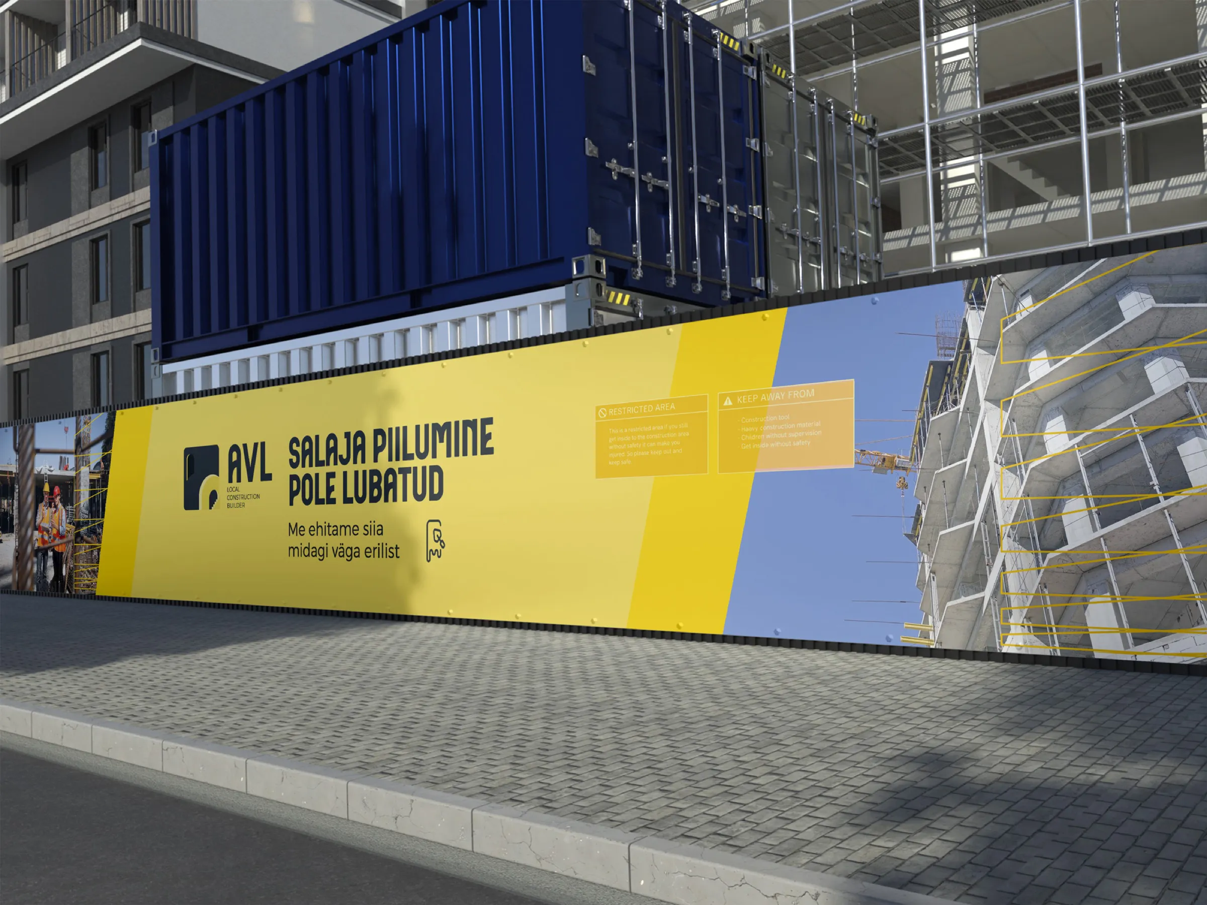
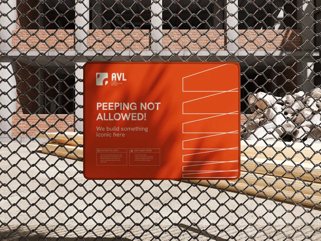
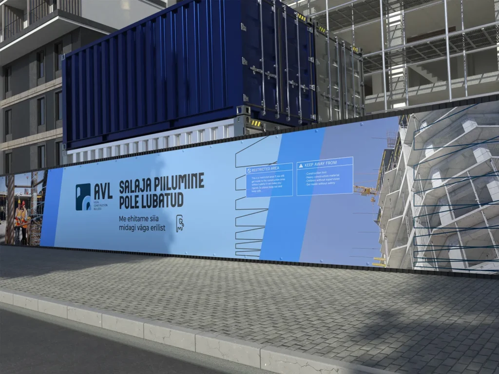
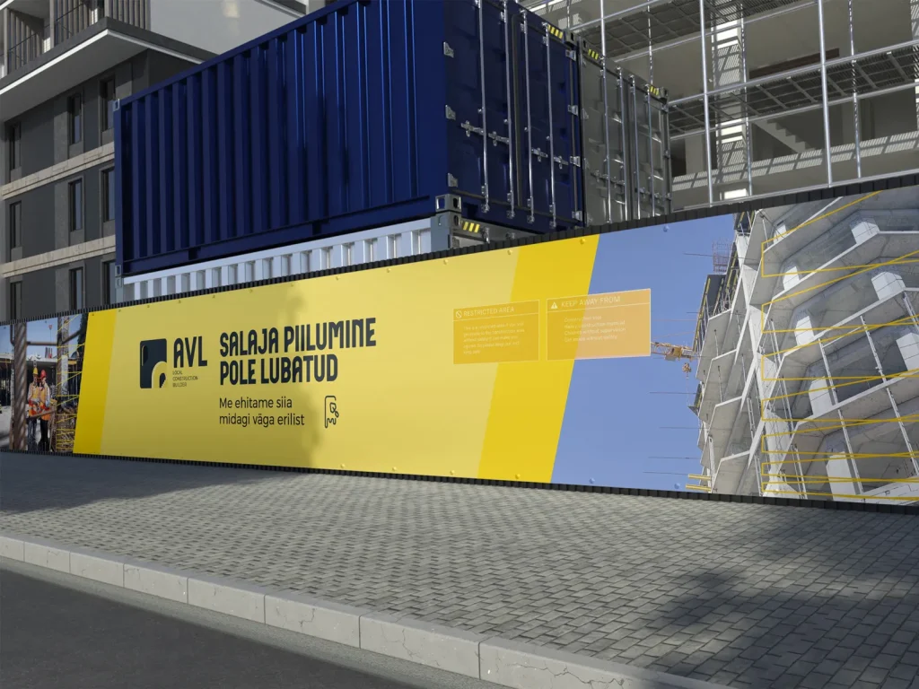
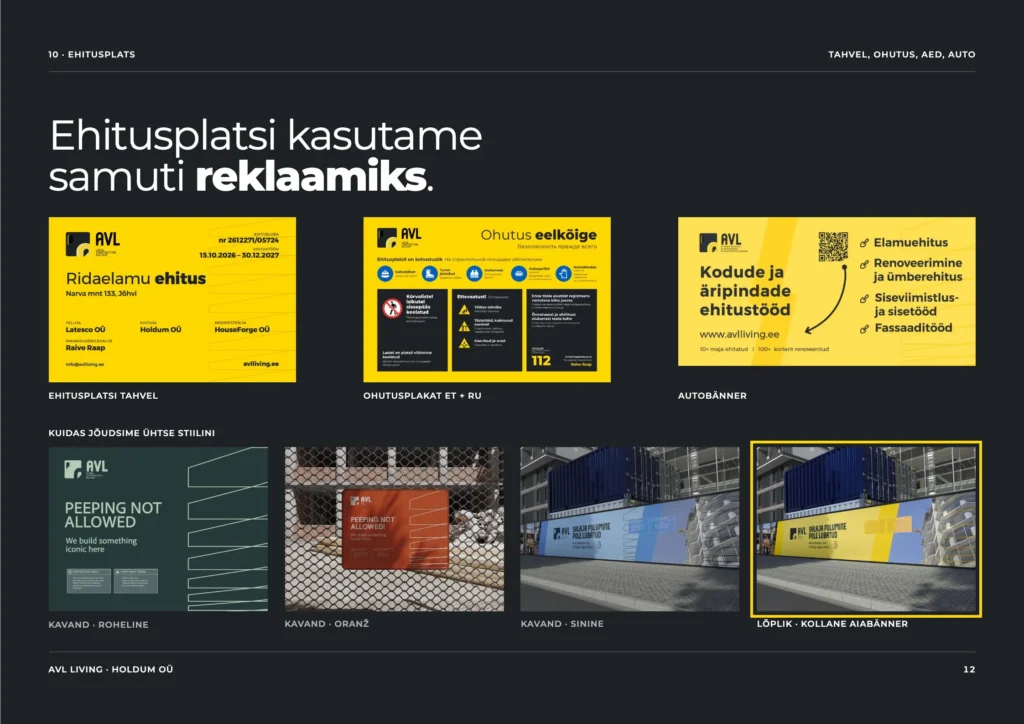
Once the brand was in place, we took it to where the most people would see it. A construction company’s biggest advertising space is its own building site. Every day a lot of people pass the fence at Narva mnt 133. A yellow banner went up on the fence with the words “Salaja piilumine pole lubatud” (“No secret peeking allowed”) and a QR code that leads straight to the page of homes for sale.
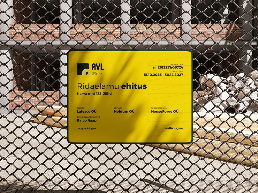
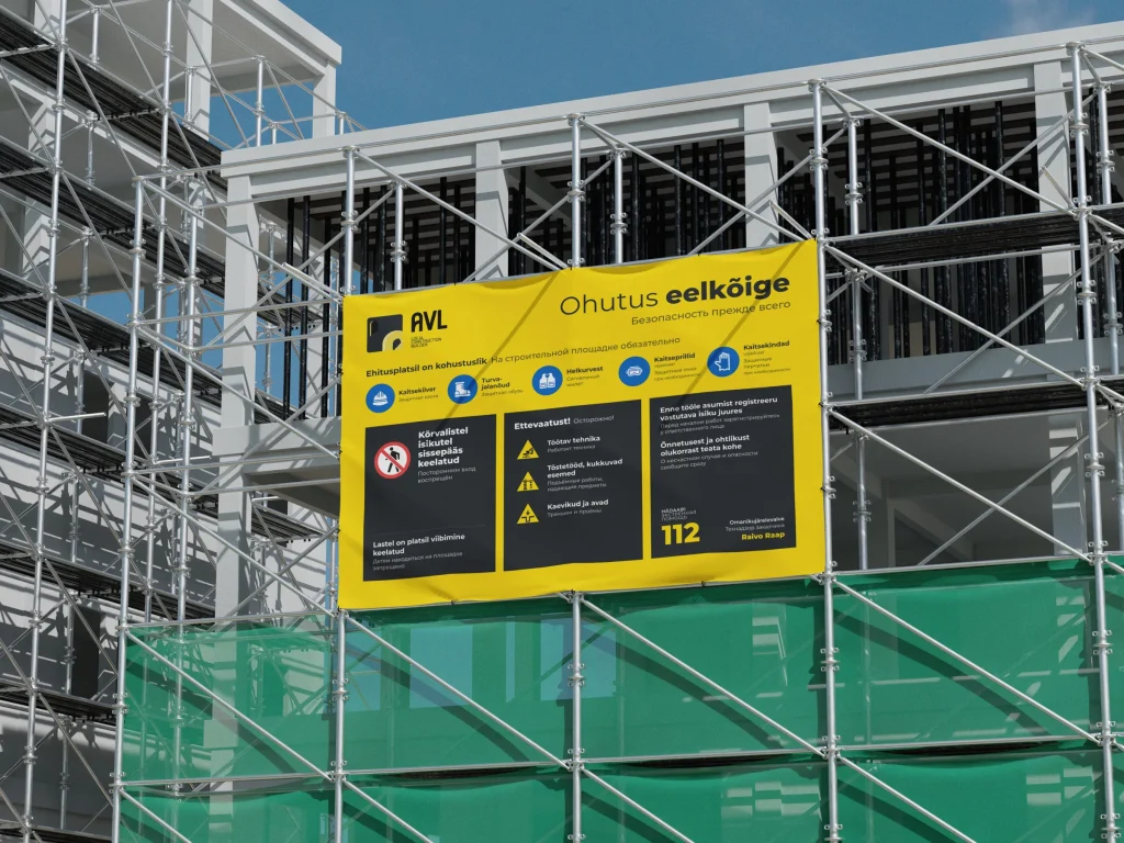
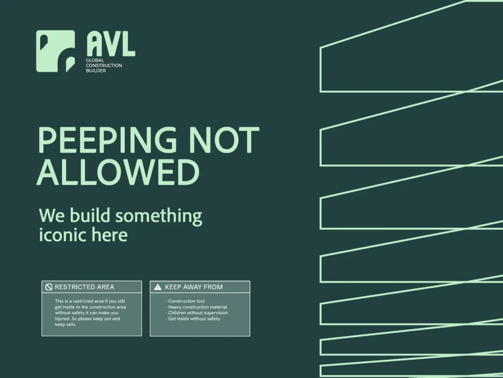
The building site board, a safety poster in Estonian and Russian and the other banners were made in the same design. Before settling on yellow, we also tried the banners in green, orange and blue. In the end we stayed with yellow, because it is the same colour as in the logo and can be seen from far away.
Fence banner drafts
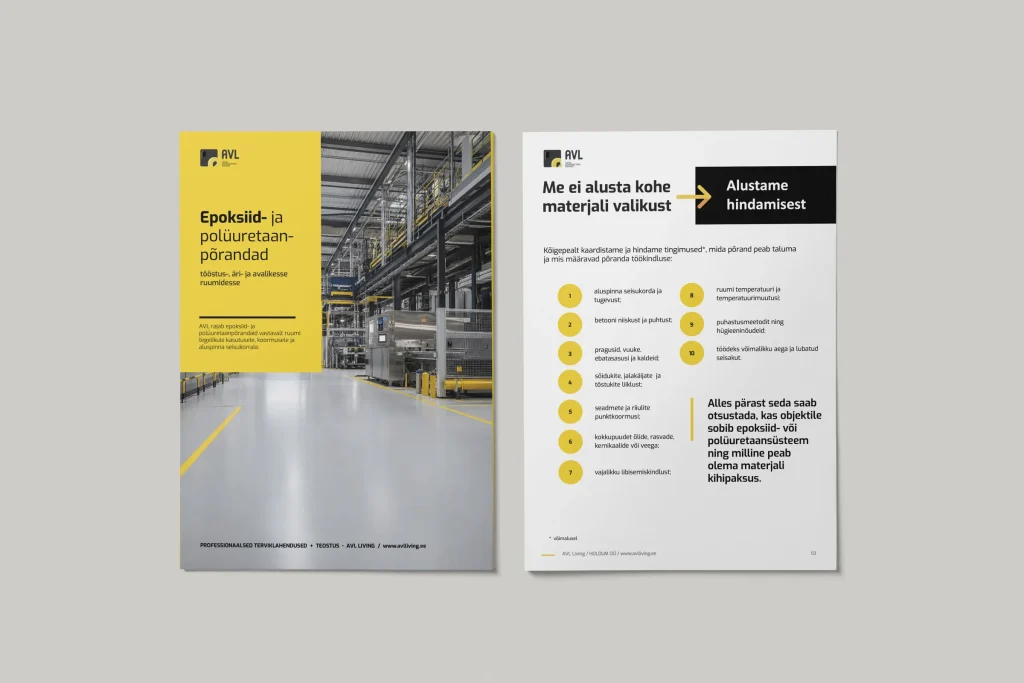
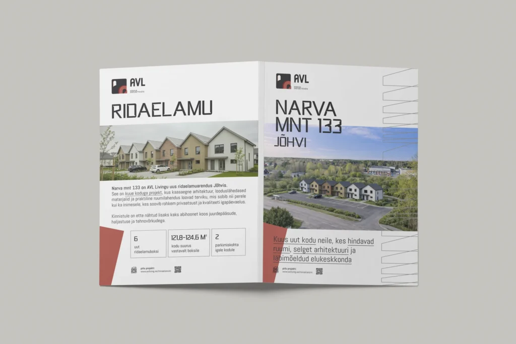
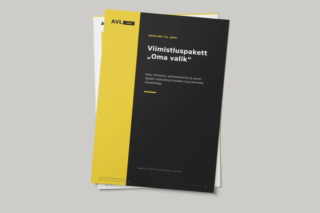
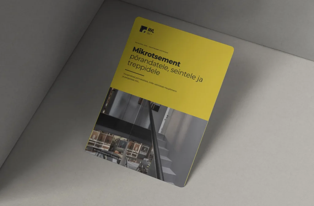
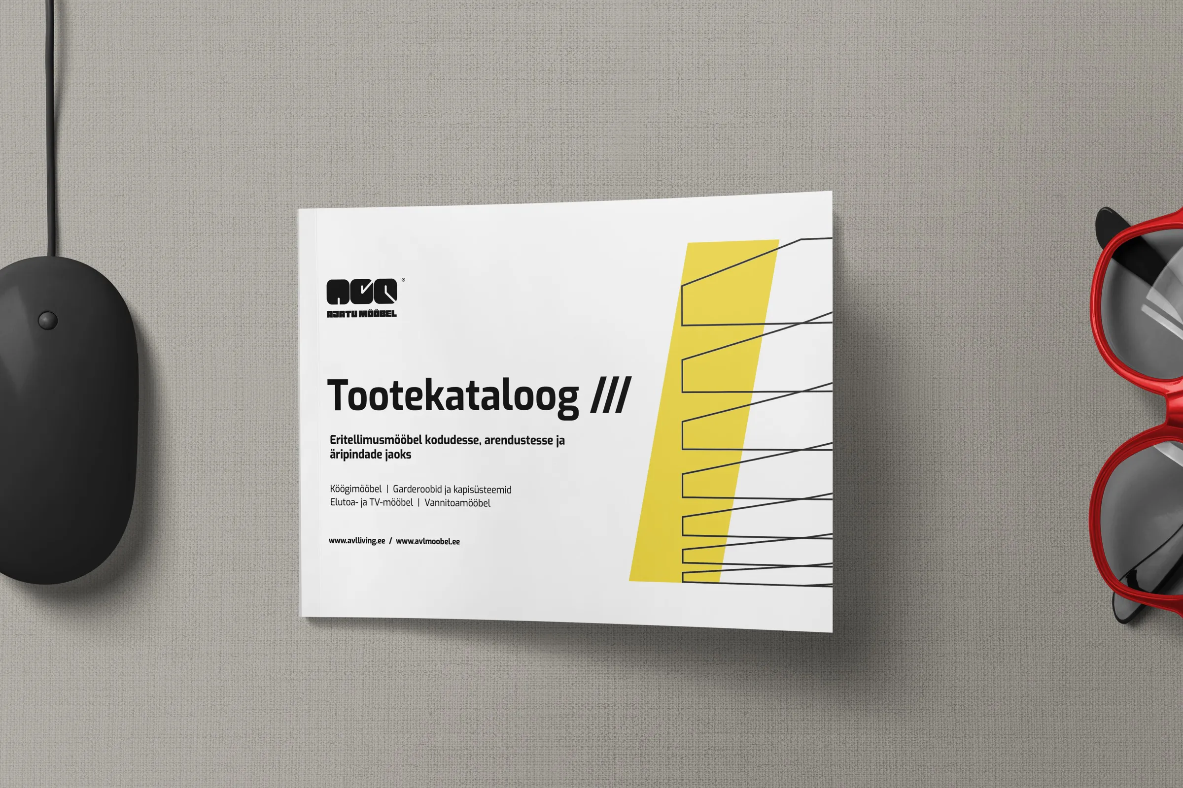
From the building site we moved on to paper. AVL does several things at once: it builds houses, renovates flats, lays floors, makes furniture and sells the homes at Narva mnt 133. We made a separate brochure for each service. They all share one style, so when you lay them side by side on a table, you can see at once that they belong together.
The cover clearly shows the logo, a large headline and a photo or simply a yellow background. The inside pages are on a light background, the stair line runs along the edge of the front or back cover, and we use yellow only where something needs emphasis. The largest print job was the 47-page catalogue for AVL Mööbel, AVL’s furniture brand. The brochures for Narva mnt 133 and the finishing packages were made in both Estonian and Russian.
The website
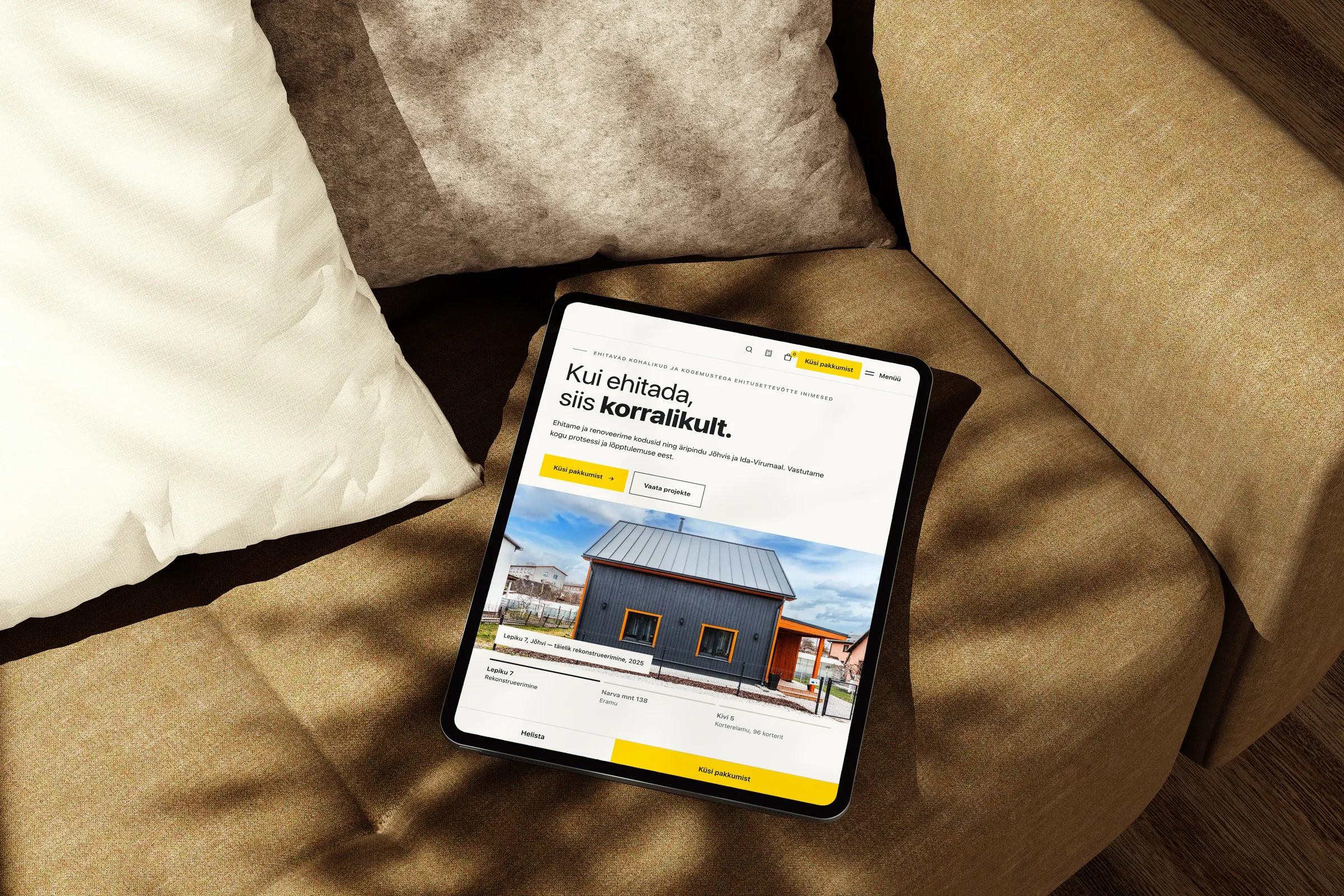
From paper the brand moved to the web, and this was the largest part of the whole project. The new website avlliving.ee had to answer the questions a client would otherwise ask on the phone. To do that, we built calculators for a new house, renovation, underfloor heating, epoxy floors, microcement and furniture. The client enters their measurements and sees straight away the approximate price range of the job.
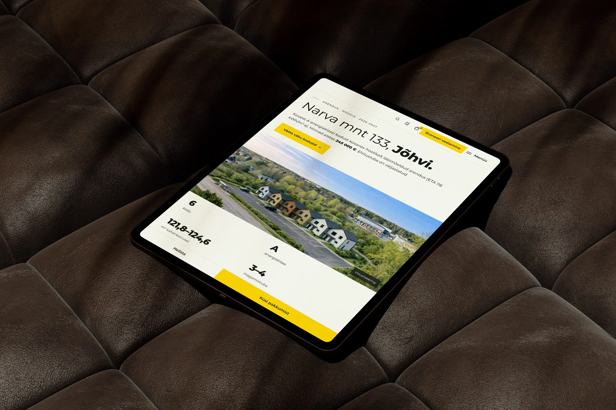
For the homes at Narva mnt 133 we made a separate sales page. There you can turn the building around in 3D, choose a unit and a floor, and see its plan and price. We also built an online shop with more than 2000 products. Everything is in Estonian and Russian, and more languages are coming soon.
Recordings from avlliving.ee
Social media
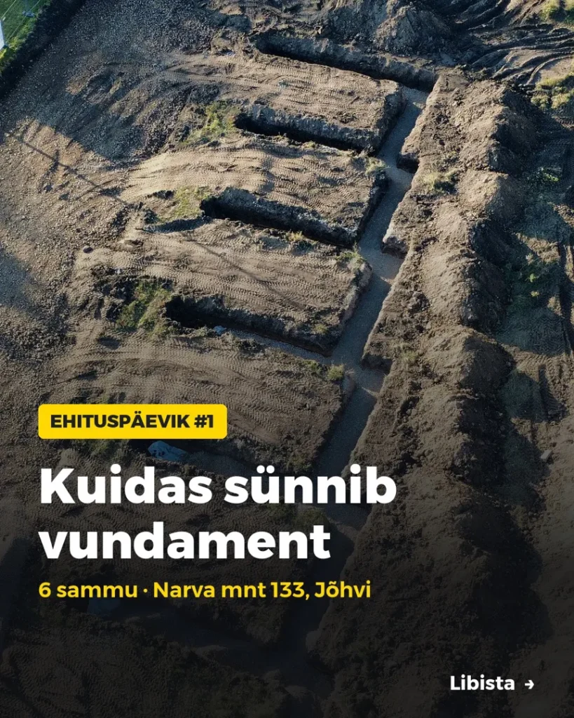
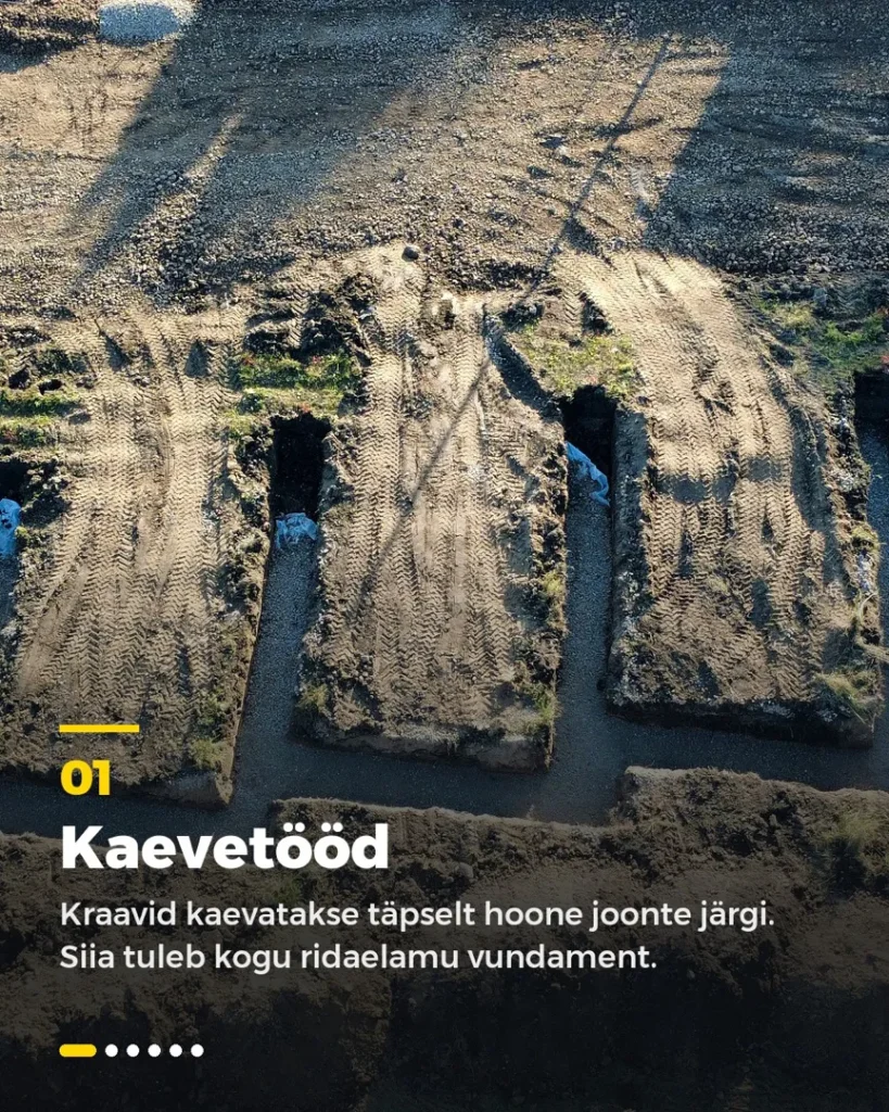
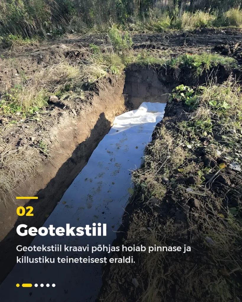
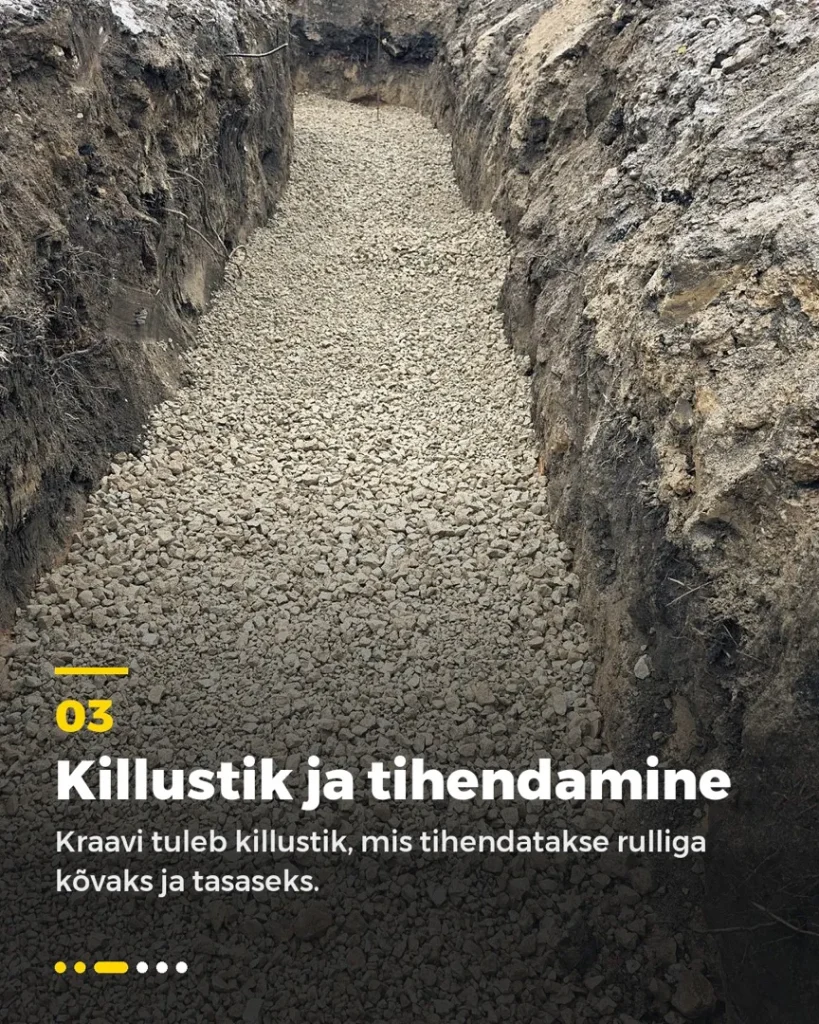
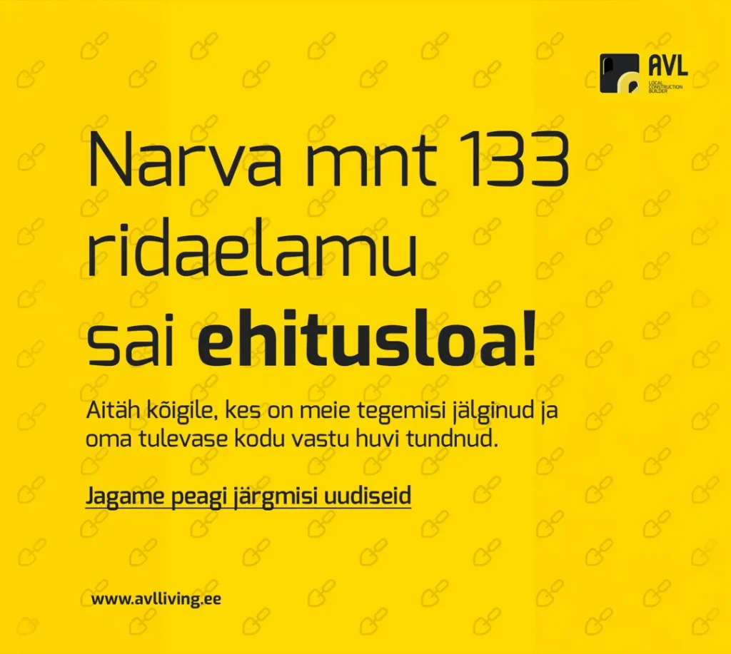
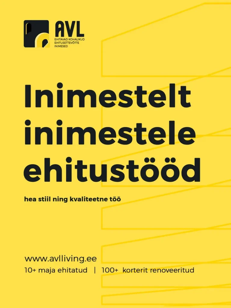
People find their way to the website through social media posts, and we make those too. We created templates for Instagram and Facebook so that every post has the same look. Announcements have a yellow background and a short headline. In the building diary we show real photos from the site and use carousels to tell, step by step, how a house rises from its foundations.
We also make short videos and Instagram stories. In the stories we ask followers questions and point them to the sales page.
Photo, video and 3D
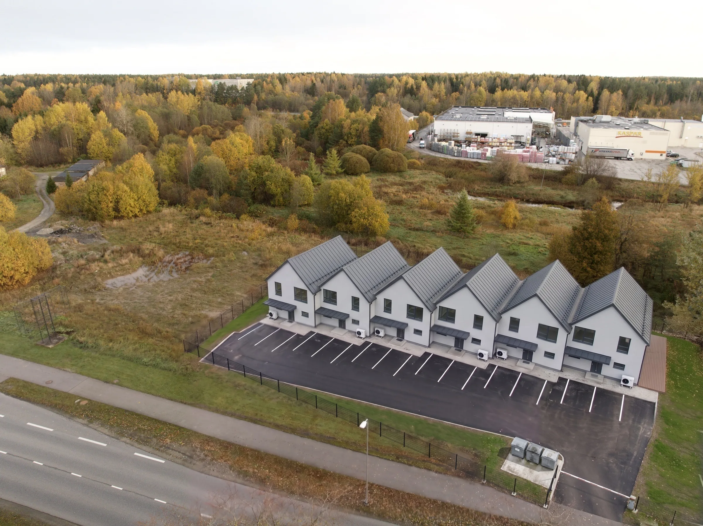
The posts and the sales page needed pictures, but a home is hard to sell while the house does not exist yet. We first built the visuals of the Narva mnt 133 terraced house in Blender, to the measurements in the construction design. Then we placed the model on a real drone photo and finished the images with the help of AI. This way a buyer can see what their home will look like before construction is finished.
From the same images we used AI to make a video in which the terraced house rises on an empty plot. It became the header video on the website and an Instagram story with text and music in the AVL style. The post states that it is a visualisation.
On real sites we also film and photograph with a drone, and we take photos both while the work is in progress and of the finished projects. If your company has also done a lot of good work that nobody can see yet, let’s talk.
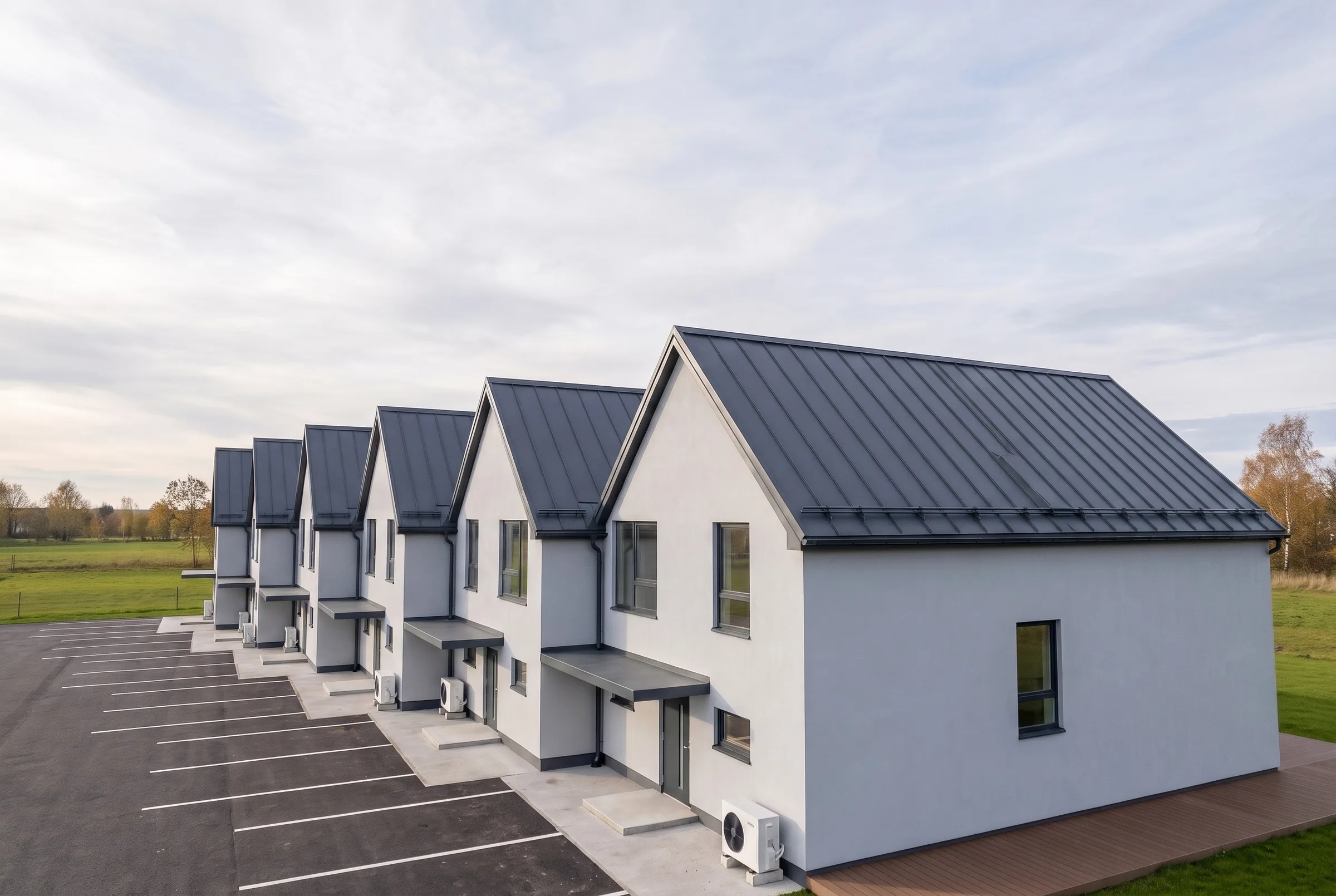
From an empty plot to a finished house
All the rules in one book
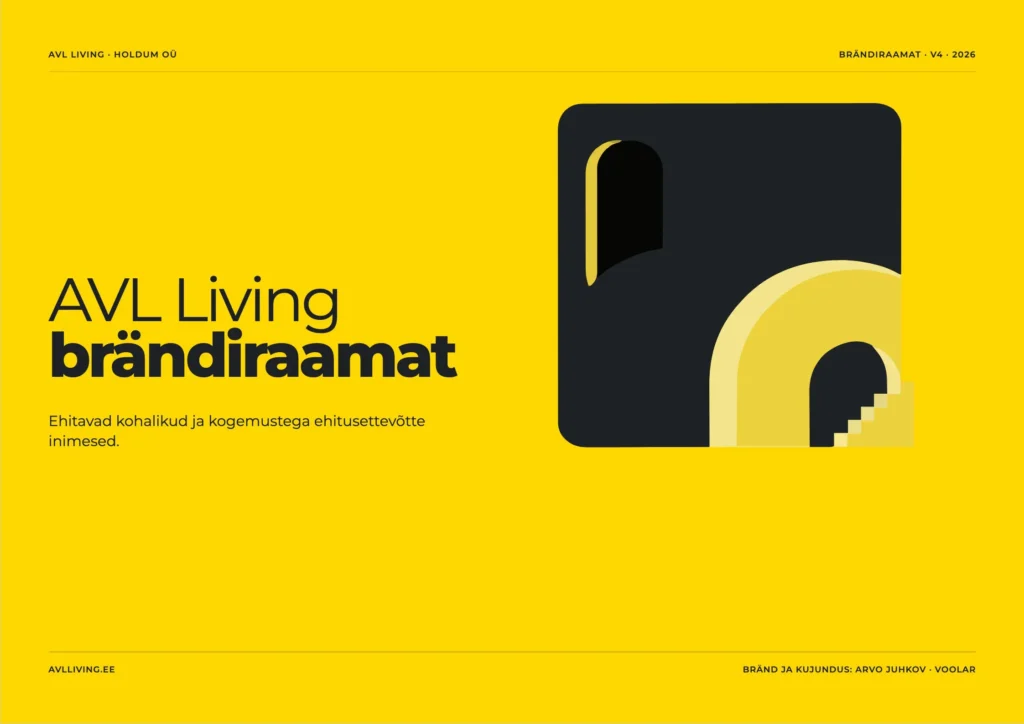
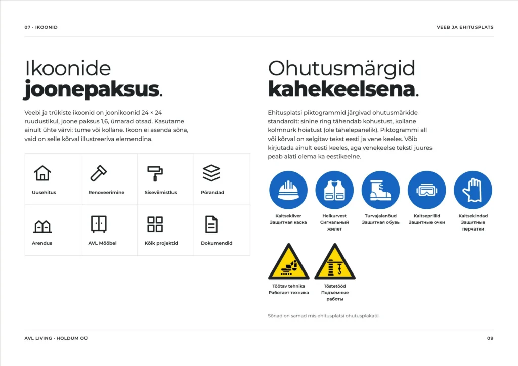
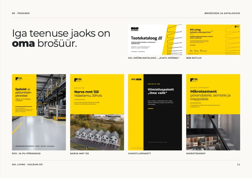
Voolar is AVL's partner across the whole project.
Strategy
- Brand DNA
- 90-day marketing plan
- B2B message
Brand
- Logo and logo story
- Colours
- Typeface
- Stair line
- Icons
- Brand book
- AVL Mööbel mark
- Brochures for floors
- Narva mnt 133 and the finishing packages
- Furniture and microcement catalogue
- B2B presentation
- Adverts
Building site
- Fence banners
- Building site board
- Safety poster
- Car banner
- Roll-up
Website and online shop
- Custom theme
- Calculators
- Narva mnt 133 sales page with 3D
- Online shop
- Search engine visibility
Social media
- Templates
- Building diary
- Short videos
- Instagram stories
- Content plan
- Posts
Photo and video
- Drone
- Site photos
- 3D visualisations
- AI video
Project management
- One contact
- Partners and print houses
In numbers
We used to have to explain to every client who we are. Now we send them a link, and they come to the meeting already knowing what they want.