Mööbliexpert
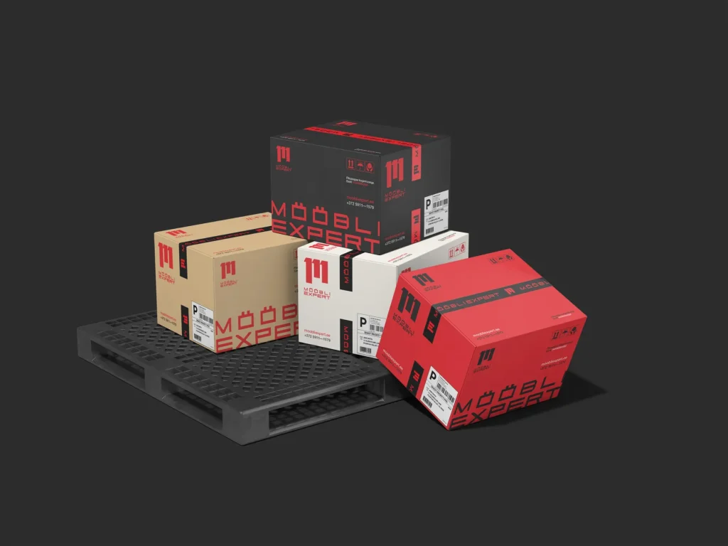
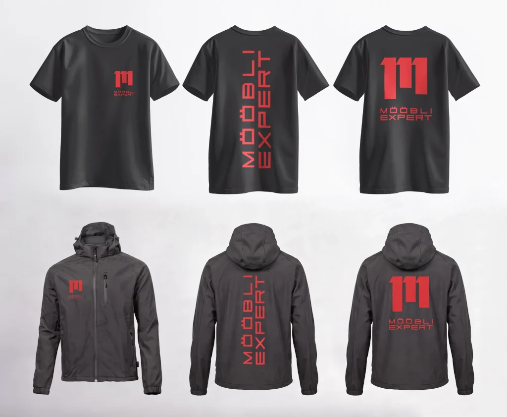
Mööbliexpert has been making custom furniture in Jõhvi since 2005 and has completed more than a thousand projects in Estonia, Finland and Sweden. The way the company looked did not show any of that experience. We created their whole brand from the ground up: the logo, colours, packaging, van livery and a website in four languages, which now tell the same story as their work.
Starting point
Mööbliexpert is one of those companies whose work has been seen by far more people than know its name. It has been making custom furniture since 2005, and in that time it has completed more than a thousand projects in Estonia, Finland and Sweden. The largest of them covered up to a hundred flats, and the business daily Äripäev has named it a TOP company nine years in a row.
The company’s look and its old website gave no hint of any of this. Someone browsing the site could not tell that behind it stood a manufacturer able to furnish an entire block of flats. That is why our goal went further than a new logo and more enquiries. The new brand had to show a reseller or a developer, already at the first meeting, that behind this name there is real capacity to manufacture and install. We built the whole brand ourselves, and we started with the logo.
Logo
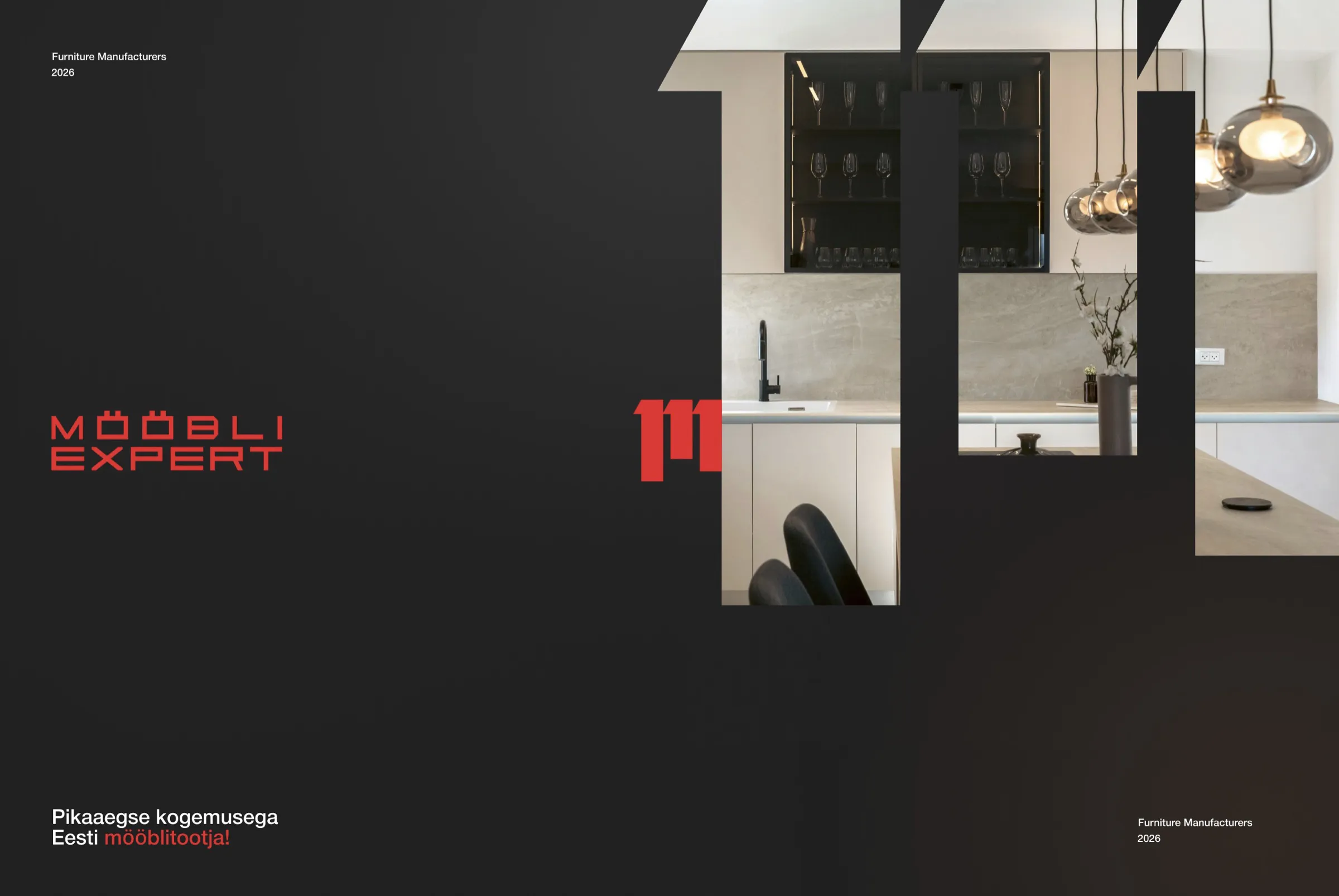
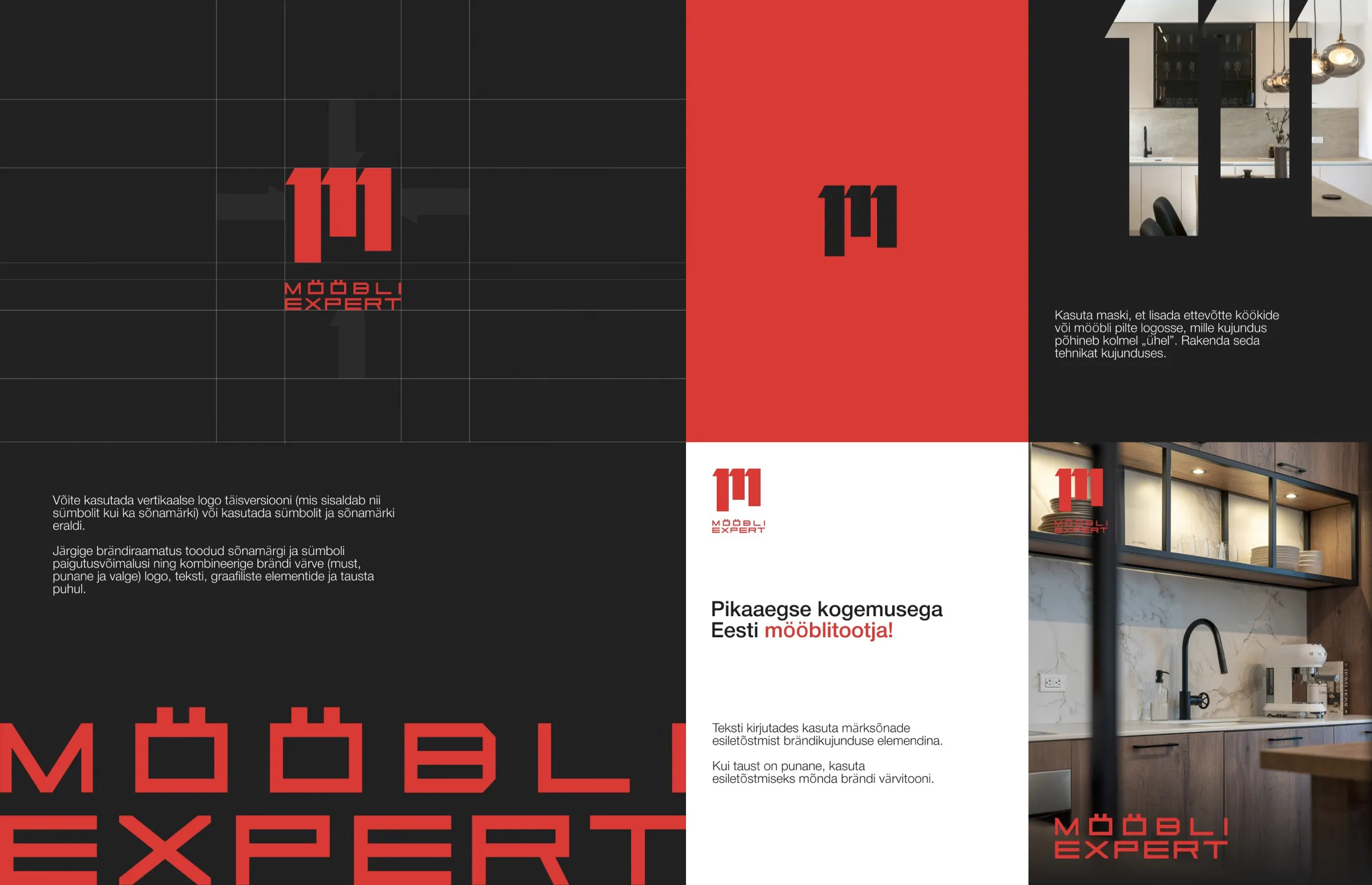
The idea behind the new logo lies in the letters. The mark is made of three upright strokes that look like 111. Seen from one side they form the letter M, and from the other the letter E. In this way both initials of the company’s name fit into one and the same mark.
The same shape also works as a window. Photos of real projects can be placed inside it, so every printed piece and every post also shows a finished kitchen or wardrobe. Next to the mark came the name in wide letters and the colours red and black, which give the impression of a manufacturer that makes its furniture itself.
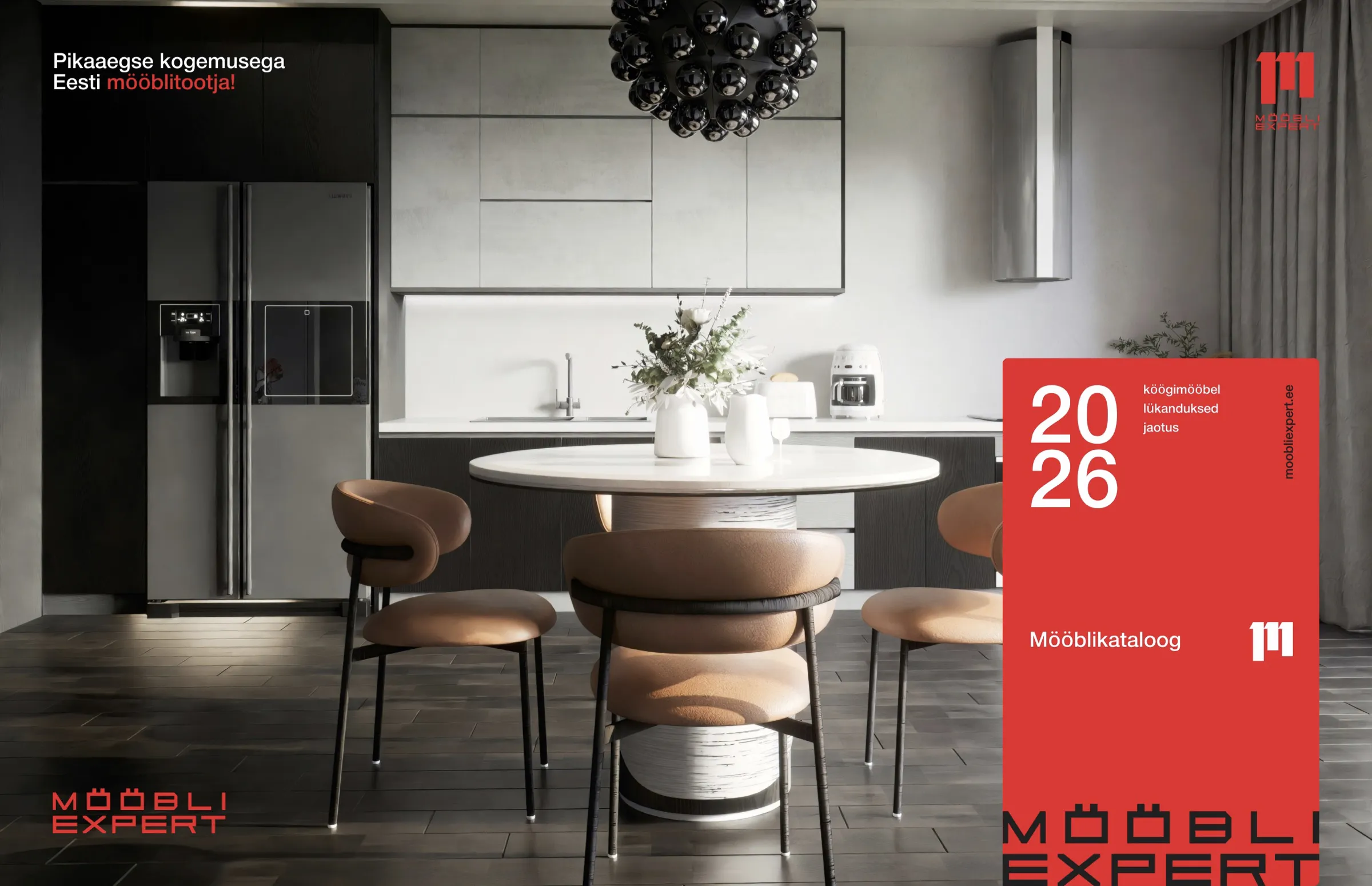
We wrote all the rules down in the brand book “Furniture Manufacturers 2026”. It contains the logo variations, the colours along with metal and coffee gradients, the typeface and the tagline “An Estonian furniture manufacturer with long experience”.
Red, black and metal
R 237 · G 28 · B 36 Furniture red
R 26 · G 26 · B 26 Black
R 229 · G 229 · B 229 Grey
R 255 · G 255 · B 255 White
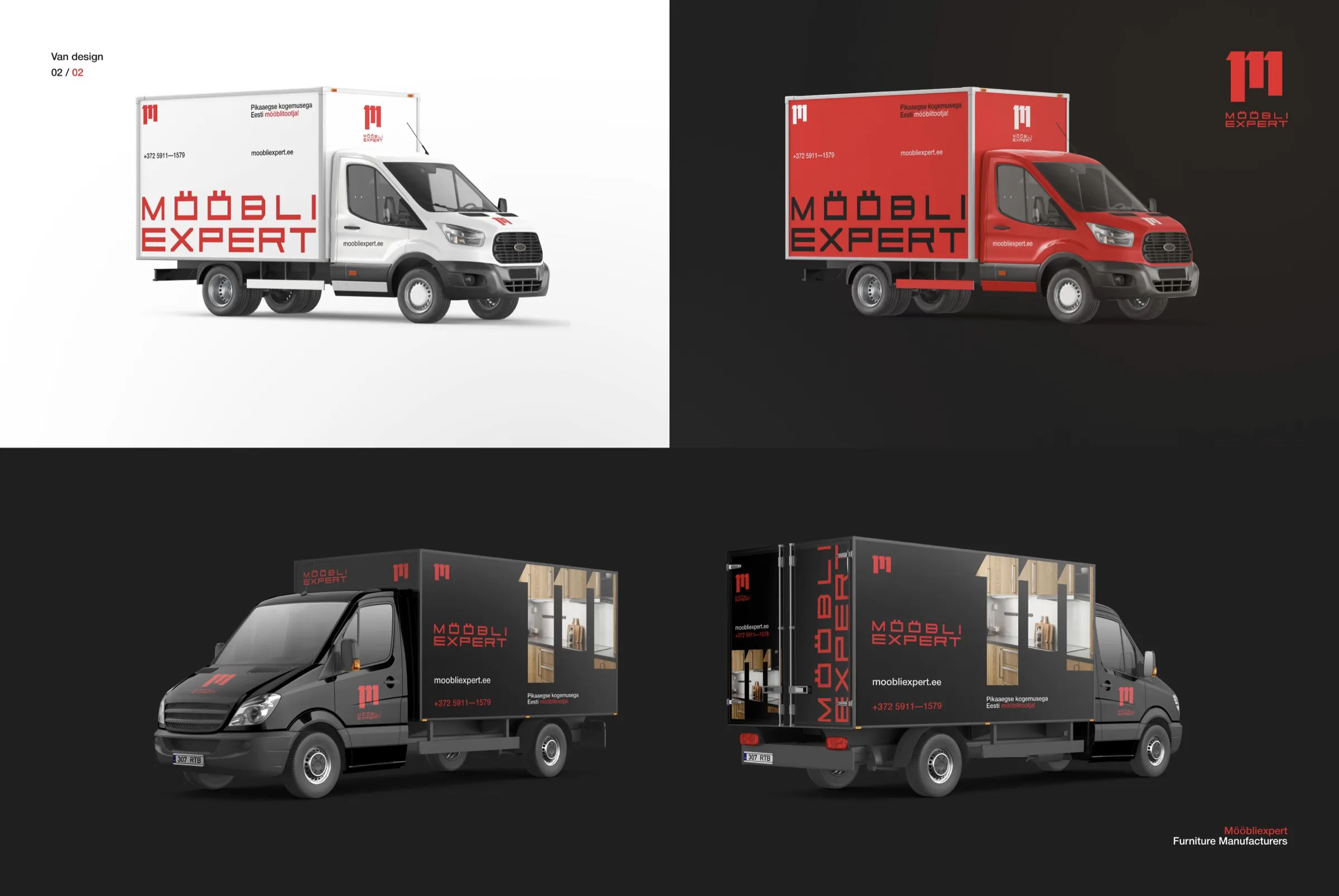
We use red only for emphasis: in the logo, in a single word of a headline and on the side of the van. The rest of the work is done by black, grey and photos of real projects.
HelveticaNeueCyr
Light · Roman · Medium · Bold · Heavy
An Estonian furniture manufacturer with long experience
Aa Õõ Ää Öö Üü Šš Žž · Бб Жж Щщ · 0123456789
We chose a typeface with Cyrillic letters, because Mööbliexpert talks to its clients in Estonian, Russian, English and Finnish.
The website
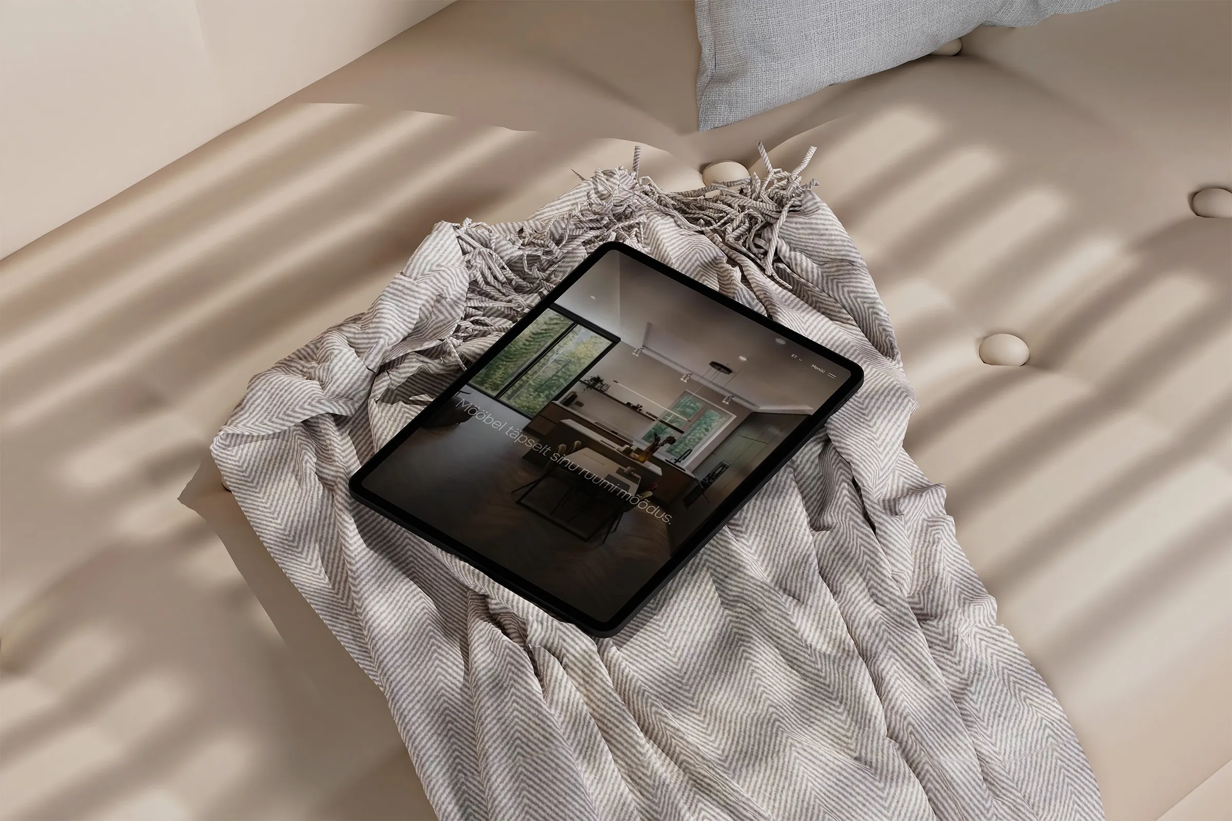
Once the brand was in place, we moved on to the website. We began with a brief of 23 chapters, setting down everything the site had to do and who it was meant for. From that brief we made three prototypes. The client chose a direction, which grew into a 15-page design for approval and then into a WordPress website.
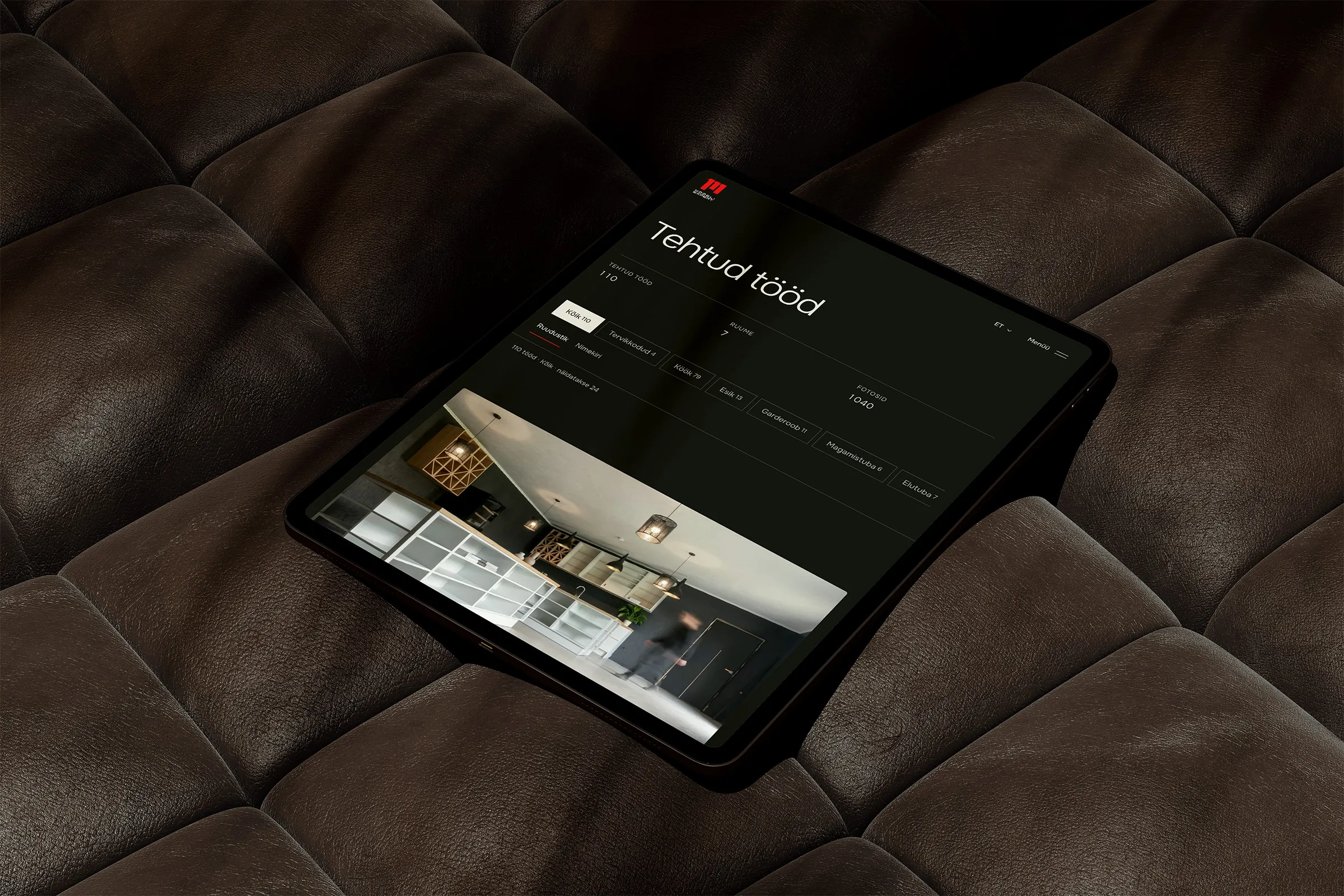
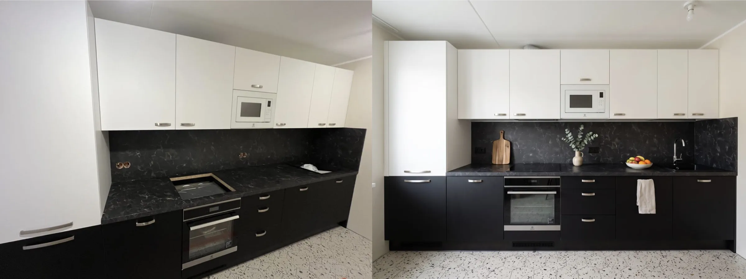
The website is dark and confident. There are no discount banners and nothing that makes it feel like a shop, because Mööbliexpert makes furniture to order and the site had to carry that feeling. Most of the space went to real work. From 495 source photos we selected and edited 260 photos of 110 projects, and built a projects page where you can browse the work by room.
The partners got a place of their own too. Resellers, developers and architects each find their own partnership page, and the materials catalogue shows 195 Kronospan and Egger decors. All of it works in four languages: Estonian, English, Russian and Finnish. If your company does more than its look shows today, let’s talk.