Factory.Sale
Factory.Sale brings factories and buyers from Estonia and the rest of Europe together in one place, so that goods reach the buyer at the factory price. We have been at the company's side since 2018, when we made its first brand and the rosette-shaped logo. Since then we have built an online shop, a separate website for selling panels, a completely new website with payments and video ads in 2025, and in 2026 a brand that gives all of its advertising one face.
Beginnings
Factory.Sale was born from a simple observation. Factories in Estonia and elsewhere in Europe make sandwich panels, insulation, parquet, saunas and much more, but a small building firm or a private buyer usually gets them through a reseller and pays for every link in the chain. Factory.Sale wanted to be the place where many manufacturers come together and the buyer gets the goods at the factory price.
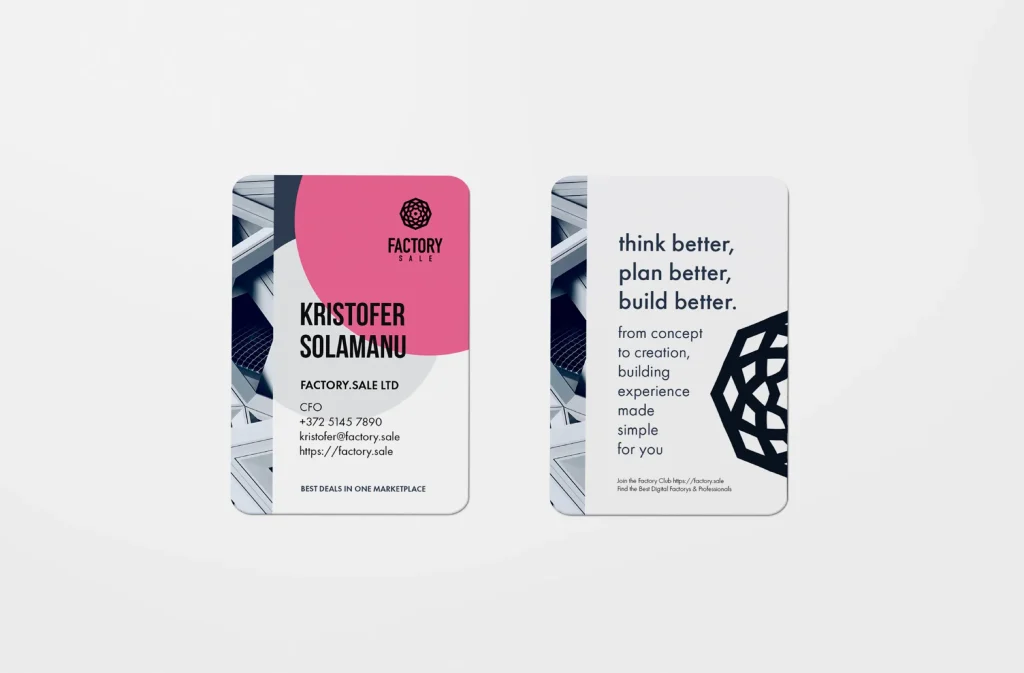
It was with this idea that Factory.Sale came to us in 2018. We made the company its first brand and advertising materials and built the system for its online shop. The brand colour was pink and the slogan read “Think better, plan better, build better”. The pink has been dropped over the years, but the eight-pointed rosette that became the logo is still in use today.
Panelfactory.sale
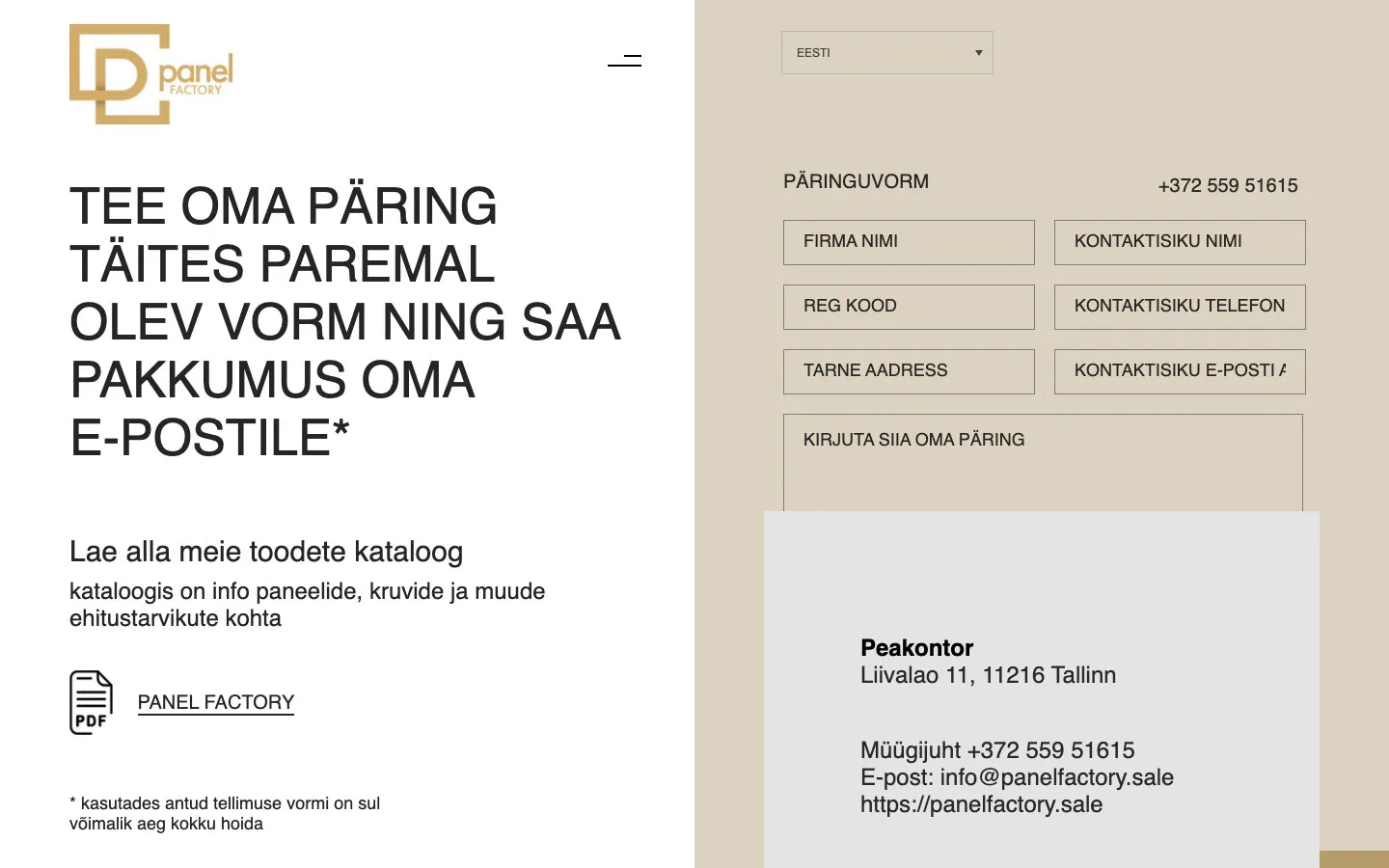
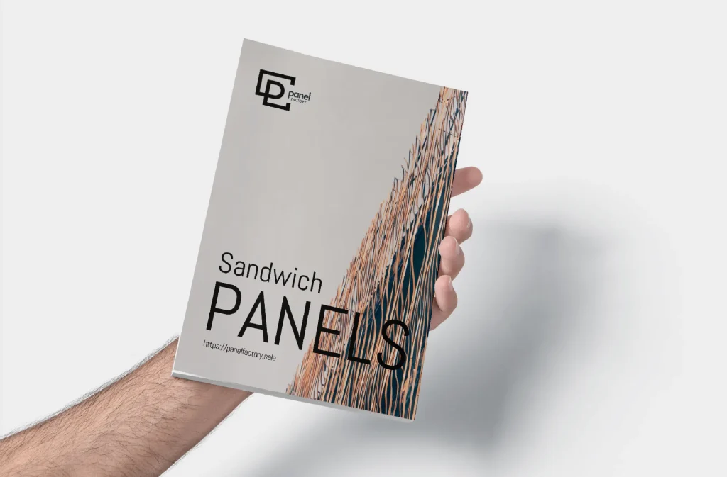
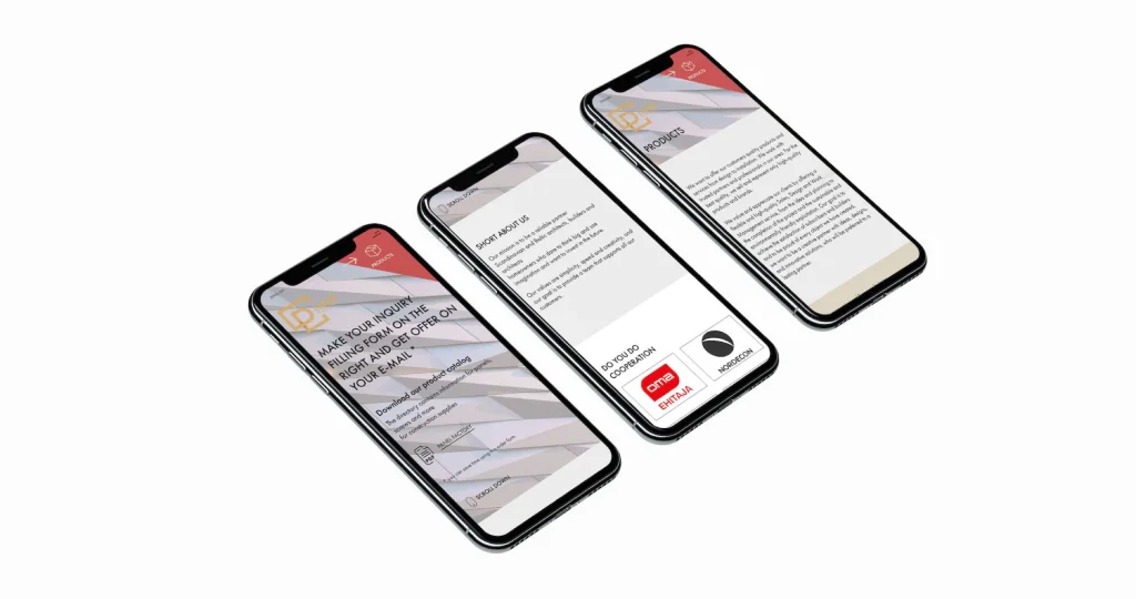
It soon became clear that sandwich panels are not bought the way saunas or parquet are. Panels are ordered for a particular construction project, in large quantities and on the basis of a quote. So we made them a separate website, Panelfactory.sale, with its own brand, product catalogue and enquiry form in Estonian, English and Russian. The site can be found in the web archive as early as the summer of 2019, and its footer reads “web & branding by voolar.agency”.
The enquiry form, where the buyer asks for a quote and receives it by email, remained at the heart of Factory.Sale’s sales from then on. Six years later, the whole buying flow of the new website grew out of that small form.
Online shop 2020
Factory.Sale’s own online shop went live in August 2020. The menu held sandwich panels, insulation, roofs, facades, windows, floors and saunas, and there were two languages, Estonian and English. Over the following years new products and categories were added, and each new thing was simply placed next to what was already there.
The shop was built like an ordinary online shop, where every product has a fixed price and the buyer puts it in the basket. Yet the final price of many products depended on the quantity, the country and the delivery. Year by year the structure of the shop and the way sales really happened drifted further apart, and by 2025 it was clear that adding more on top would no longer do. The website had to be rebuilt from the ground up.
Brief 2025
The new website opened a new chapter in our work together. The biggest concern was trust. When a buyer sees a very low price, the question immediately arises whether the service and the quality of the goods are cheap as well. The new website had to answer that question before the buyer even asked it.
Buyers did not know Factory.Sale, and before paying they wanted to see who was selling, how quickly they would get an answer and how their money was protected. At the same time the range was enormous, 17 main categories and 195 subcategories from sauna stoves to construction chemicals, and everything had to be found in two clicks. There were also two kinds of buyers. A private person wants to see the price including VAT, while a company wants it without VAT and needs an invoice and a VAT number. And since the goods are sold to several countries, the very first visit also had to make clear where the goods would go and what delivery would cost.
Design and development
We started with a list. We wrote down every page the shop needed, and next to each page what it had to do for the buyer. That came to 20 page types, from the home page and the product page to the price enquiry, payments and legal information. Every page got its own line in the schedule, so that design and development could partly run at the same time.
No page went into development from its first draft. We made four versions of the home page, six of the shop page, four of the category page and five of the product page. The client commented directly in Figma and every round added something. The home page gained discounted products, well-known brands and a blog, and the product page gained the ordering steps, technical data and products that go together. We gathered the approved pages in a separate folder, and only then did development begin.
We built the website on WordPress and WooCommerce, but with our own theme, so that the shop can keep growing without another rebuild. There are three languages: English, Estonian and Finnish.
Buying flow
The enquiry form that Panelfactory.sale already had in 2019 now became the heart of the whole shop. The final price of a hot tub, a sandwich panel or a thousand-litre tank depends on the quantity, the country and the delivery, and the buyer wants to know the exact amount before paying. So the buyer moves from a category to the product page, puts products into an enquiry basket and sends a short form. Factory.Sale replies with a quote, and the buyer pays in whichever way suits them.
We solved the problem of the two different buyers in the header. There is a price switch that shows prices either including or excluding VAT, so that a private person and a company each see their own figure straight away. Since July 2026 the product page has also shown a notice about the minimum order quantity, so that the buyer does not discover it only when sending the enquiry.
Payments
Once the amount is clear, all that is left is paying. A ten-euro accessory and a twenty-five-thousand-euro project cannot go through the same payment method. A private buyer pays for a smaller order by card, and the bank asks for confirmation in its app or with a code card. With a large order, especially the first deal, the buyer wants to be sure that the money reaches the seller only once the goods have arrived. That is what Escrow is for: a neutral party holds the money in the meantime.
We lined up the four payment methods, Visa Secure, PayPal, Escrow and bank transfer, according to the type of order, and made an illustration for each one that explains it at a glance. The illustrations are in English and Finnish. This way the buyer does not simply have to believe that their money is protected. They can see from the picture how the money moves.
The website today
Today everything is in one place on factory.sale: the shop, the price enquiry, the payments and the campaigns. The website has also kept growing after the launch. In 2026 accounts were added, where a returning buyer can see their orders, favourites and details. In July we redesigned the header and added a country selector with a first-visit window, along with a new basket and checkout. Now the buyer knows where the goods will go and at what price before they even start browsing.
Video ads
Once the website was ready, people had to be brought to it. For the Google Ads campaigns we made 15-second video ads for a hot tub and a thousand-litre IBC tank. Every shot comes from Factory.Sale’s own product photos, warehouse photos and customer photos, so everything you see in the videos is really for sale. Each video comes in three formats: widescreen for YouTube, square for banners and vertical for short videos. Every format is designed separately, so that the product and the text never fall out of the frame.
The videos are rendered from code. When a text, a photo or the timing needs to change, everything else stays in place, and the same template can be used to make an ad for every new product group.
Hot tub and IBC tank
Campaigns
We took the same approach to the campaigns. For Black Friday 2025 we made three offers in Estonian, English and Finnish. All nine images follow one template, so adding a new language or offer takes little time and the campaign looks the same in every country.
Brand 2026
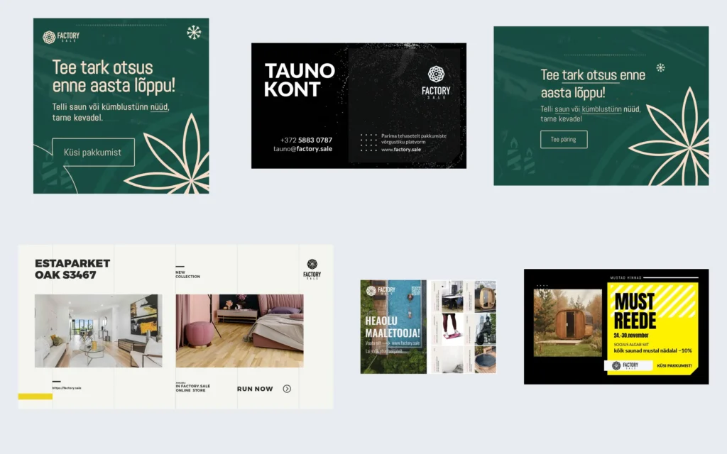
The website, the videos and the campaigns now spoke the same language. The rest of the advertising did not. It had been made over the years at different times and by different hands, and each piece spoke in its own voice. The Christmas banner was dark green with golden leaves, the business card black with a dot pattern, the parquet ad light like an interior magazine and Black Friday bright yellow. Side by side, they looked as if six different companies had made them. For a seller with factory prices that is dangerous, because a low price already makes the buyer cautious. It was the same concern we had on the table when we made the website.
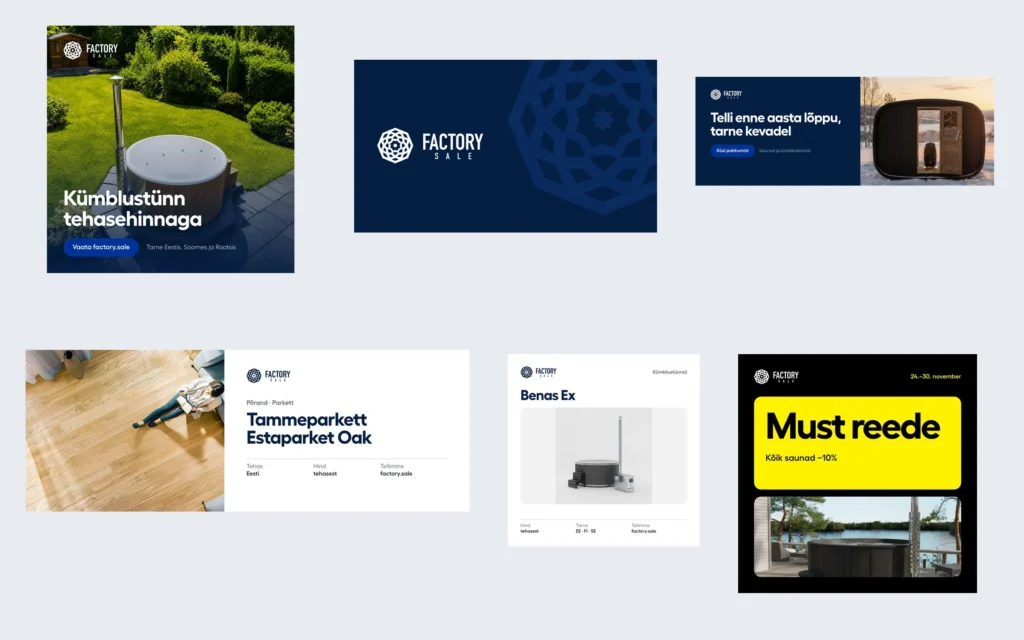
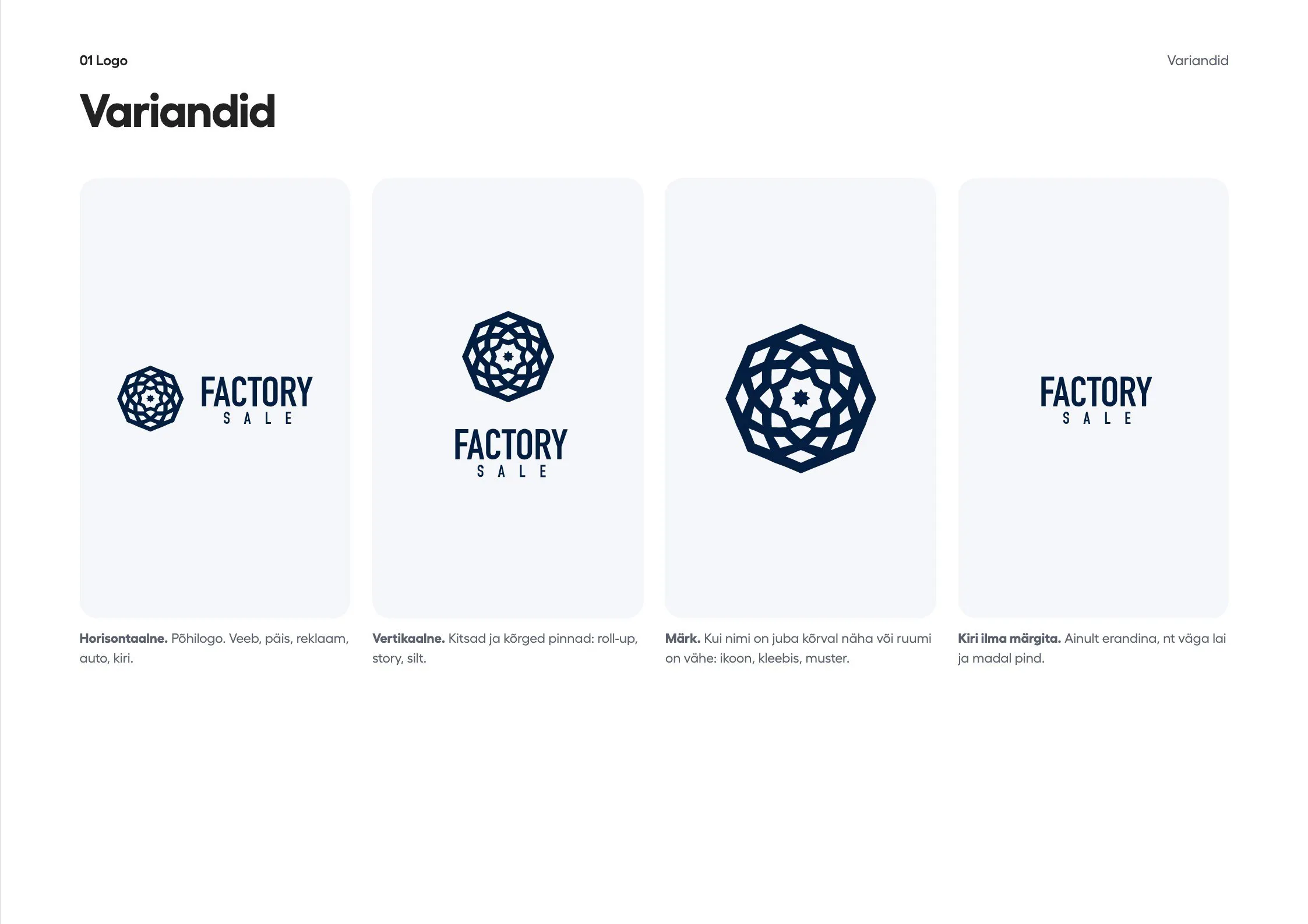
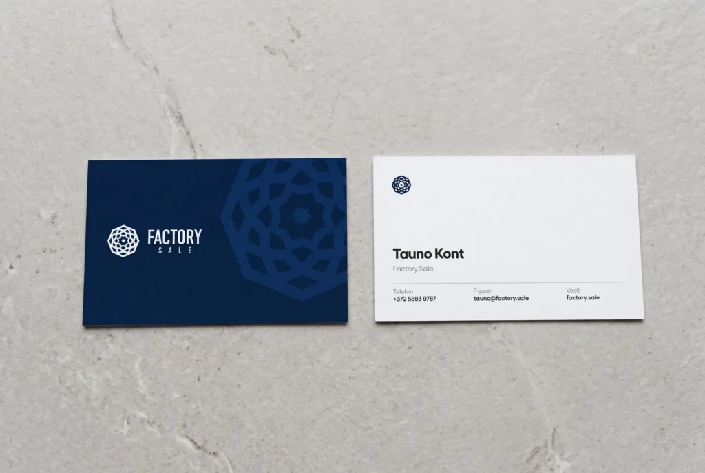
We did not change the logo. The rosette has been with Factory.Sale since 2018 and is the company’s oldest mark. We redrew it cleanly and made all the variants that everyday work calls for. We took the colours from the code of the new website, so that the ad and the page the buyer clicks through to share the same shade. The main colour became a deep navy, with white beside it and a bright blue used only on buttons. All the text is set in Fellix, as on the website and in the videos.
The same ads before and after
Navy, white and blue
R 4 · G 30 · B 66 Deep navy
R 0 · G 51 · B 153 Blue
R 245 · G 246 · B 250 Background
R 255 · G 241 · B 0 Campaign yellow
The colours are the same as on the factory.sale website. We use yellow only in the Black Friday campaign.
Photo and catalogue
Harder than the colours and the type was the sheer breadth of the range. The same shop sells saunas in evening light and grey industrial IBC tanks. With a sauna, mood helps to sell; with a tank, the buyer wants to see the dimensions, the price and the delivery time.
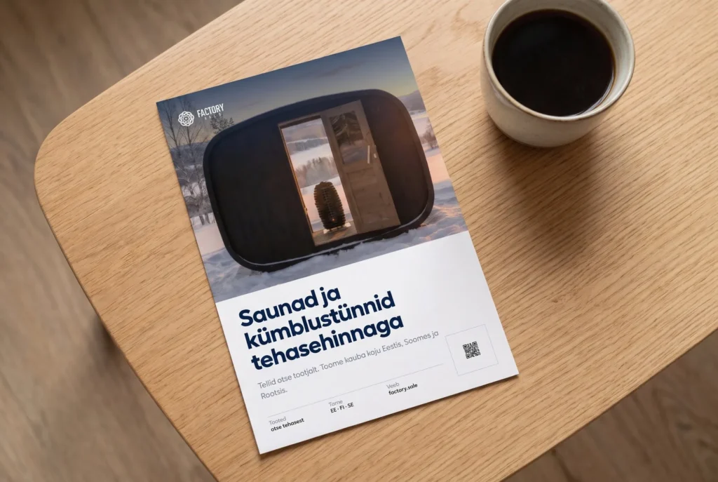
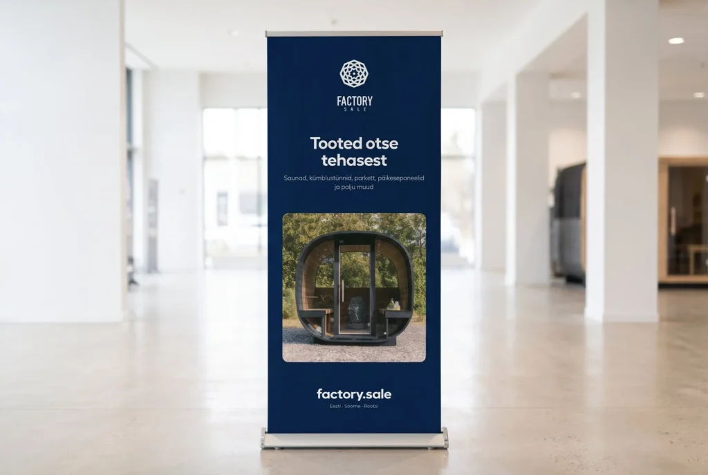
That is why the style has two forms. The photo ad has a navy background and shows the product in its real setting, such as a sauna in the middle of the snow or a hot tub in a garden at dusk. The catalogue ad is white and orderly, like a good price list: the product stands on a clean background, with lines below it about the price, delivery and ordering. Both forms have the logo in the same place, the same rounded corners and the same typeface, so you can recognise a Factory.Sale ad before you have finished reading the headline.
One exception remained. Black Friday is still yellow and black, because those are the colours by which buyers recognise the campaign. What is new is the position of the logo, the type and the layout, which come from the same style as everything else.
Posts and Instagram stories
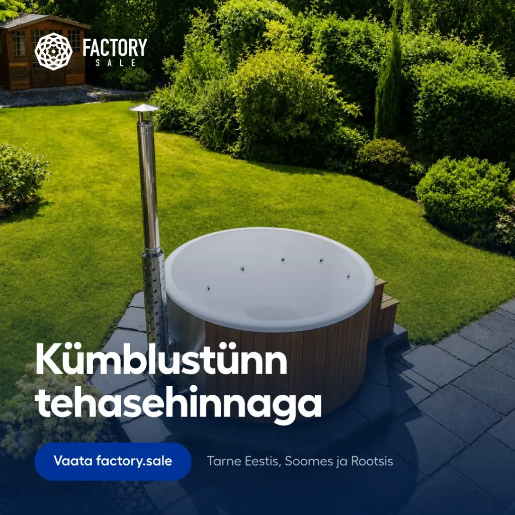
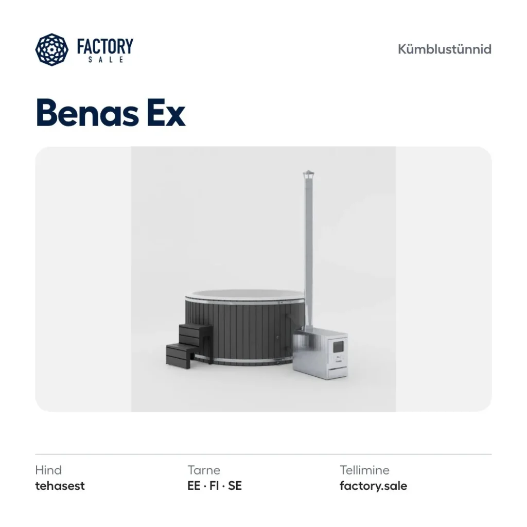
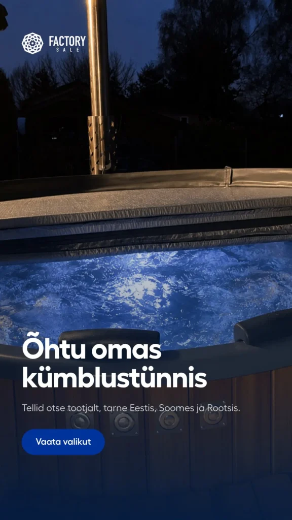
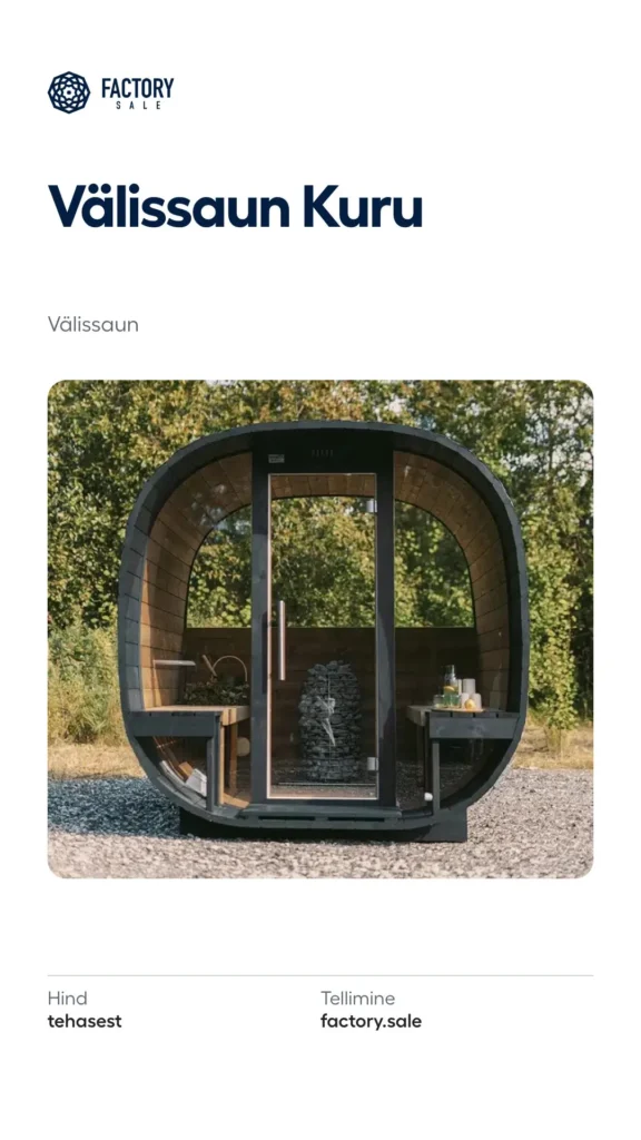
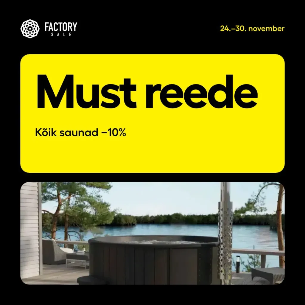
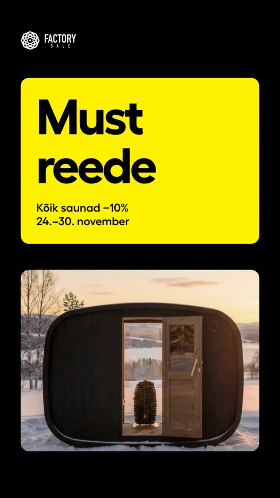
In use
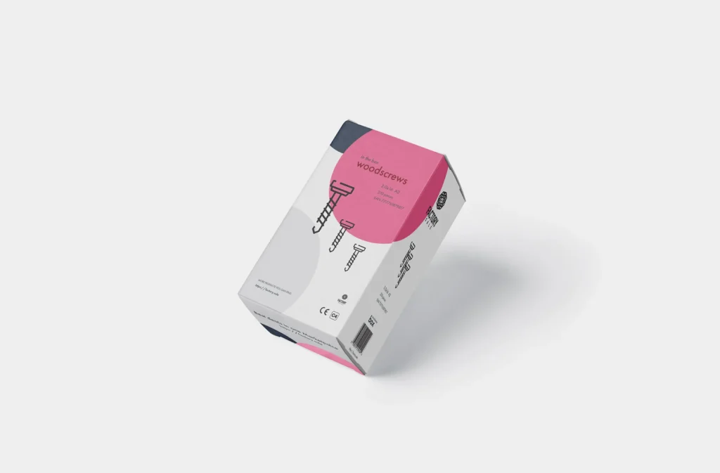
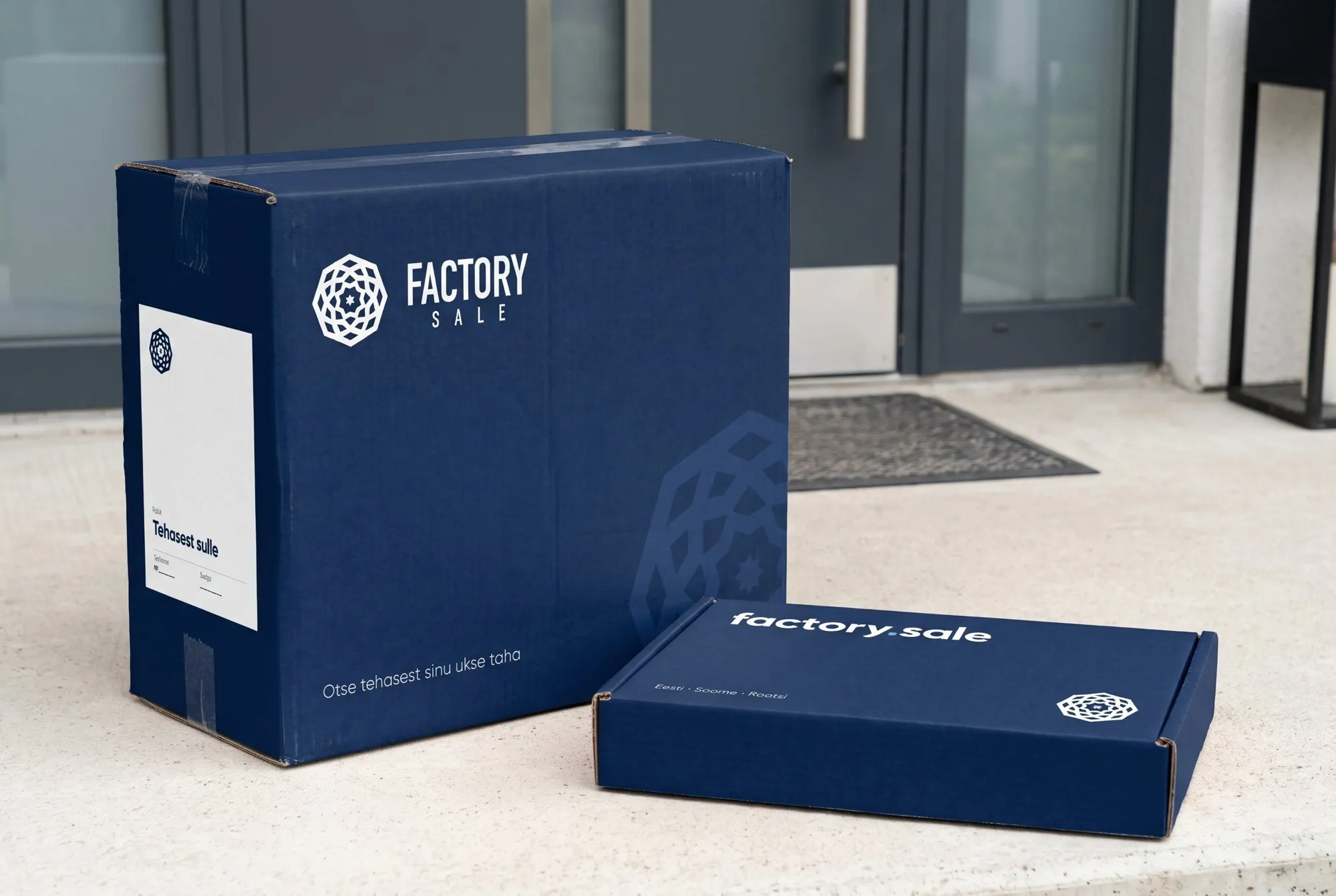
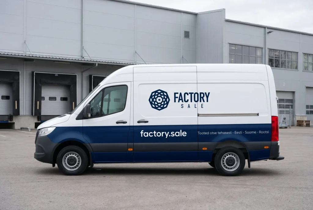
The value of a style only becomes clear when it is used on real things. In the new style we designed everything Factory.Sale needs in its everyday work: a business card, an A5 flyer, a roll-up for trade fairs, van graphics, a parcel box, a LinkedIn cover image, an email signature and a quote form. We also remade the Christmas banner and the parquet ad from the old advertising. Put them next to the old ones and you can see how much more consistent the company now looks.
Brand guidelines
To make sure this consistency lasts, we wrote down every decision in a 14-page brand guidelines document. In it you will find the logo variants, the clear space around the logo and its smallest permitted size, examples of what must not be done with the logo, the colours with HEX, RGB and CMYK codes, the typeface, the two forms of the style and the rules for Black Friday. The guidelines can be sent to a print shop, an advertising agency or a new designer. Factory.Sale’s look no longer depends on who happens to be making the ad.
What comes next
A website is never quite finished. We took a fresh look at today’s factory.sale and wrote down five improvements we would make next. The first-visit window takes up too much space at the moment and could shrink to a single line in the header. The enquiry button could say what happens after sending, and the enquiry form could be split into two steps. The top bar could tell the buyer something useful, and the year in the footer should update itself.
The bigger steps will come together with the factories, because the platform grows with them. Bulk buying, product variants with a configurator, and a newsletter with catalogue ads are in the works. Swedish, delivery to Norway and the islands, and a video for every product group are planned.
In numbers
What we did
Beginnings 2018–2020
- Logo and brand
- Advertising materials
- Online shop system
- Packaging
- Trucks
Panelfactory.sale
- Brand
- Product catalogue
- Website with enquiry form in three languages
Web 2025
- UX and buying flow
- 20 page types
- WordPress and WooCommerce with our own theme
- Three languages
Ordering and payments
- Price enquiry
- Prices with and without VAT
- Country selector
- Accounts
- Payment method pages
Advertising
- Video ads for Google Ads
- Black Friday campaign in three languages
Brand 2026
- Brand guidelines
- Logo variants
- Printed materials
- Packaging
- Van
- Social media
Eight years with one client
Factory.Sale is a complex shop. The range is wide, there are two kinds of buyers, the goods go to several countries and many orders begin with a price enquiry. We have been at the company’s side from the first logo to today’s website, payments, video ads and unified brand. Every step has been built on the one before, because we know where each earlier decision came from. That is how the 2019 enquiry form ended up at the centre of the new website’s buying flow, and the 2018 rosette in the 2026 brand.
If you are looking for a partner who thinks about your brand and website further ahead than a single project, write to us. We will work out together where to begin.