Ida-Viru Enterprise Centre
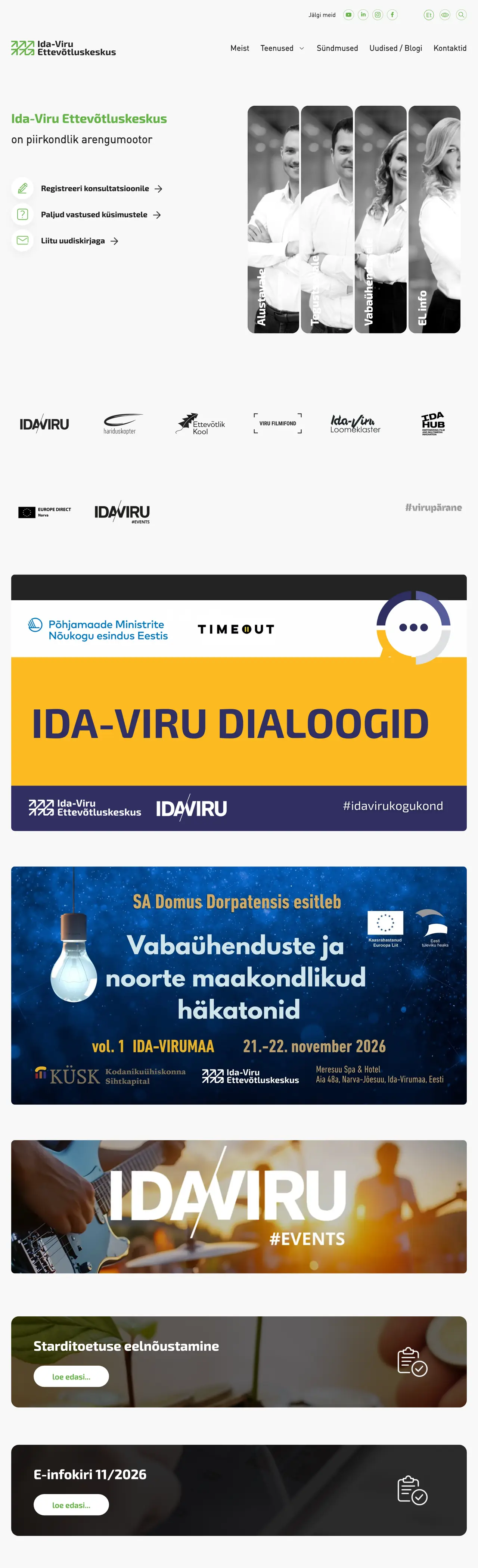
Ida-Viru Enterprise Centre advises entrepreneurs, investors, associations and public bodies across Ida-Viru County. Before we started shaping a new face for the centre, we asked its clients how they saw it, and it turned out that many of them did not really know what the centre does. That work grew into a logo that is in fact a growth chart, and a website the size of a small news portal.
The logo as a growth chart
- 1The company received a start-up grant and begins its growth from a higher point
- 2The company starts from absolute zero
- 3The company has been in business for a year or two
- 4The company had stalled and began to grow after receiving advice
Client survey
People come to Ida-Viru Enterprise Centre, or IVEK, with very different needs. Advice is sought by someone who wants to open their first company, and also by an entrepreneur whose business has stalled and who is looking for a way to start growing again. Alongside them, the centre hears from investors, non-profit associations and foundations, educational and research institutions, and government agencies. Whoever walks through the door is looking for advice that will help them move forward.
Over the years IVEK’s promotional materials had drifted off in different directions, and the centre had no face by which people could recognise it straight away. They wanted a completely new identity that would bring all of the centre’s communication into one line and show what IVEK works for.
We did not start sketching a logo right away. First we wanted to know how the centre is seen by the people it exists for. Together with a customer research specialist, we asked IVEK’s clients what they think of the centre and what they expect from it. The answers showed that many of them did not know what IVEK actually does. That became the starting point for all the work that followed. The new face had to say at first glance what the centre is there for.
- Someone opening their first company
- An entrepreneur whose business has stalled
- An investor
- A non-profit or a foundation
- An educational or research institution
- A government agency
Logo
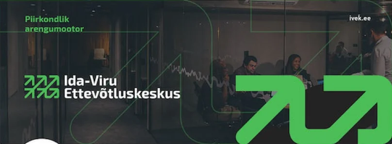
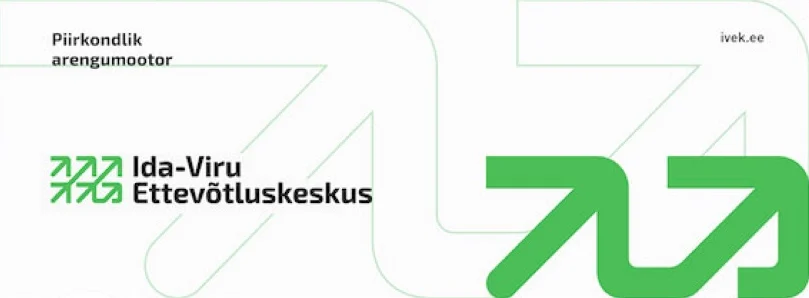
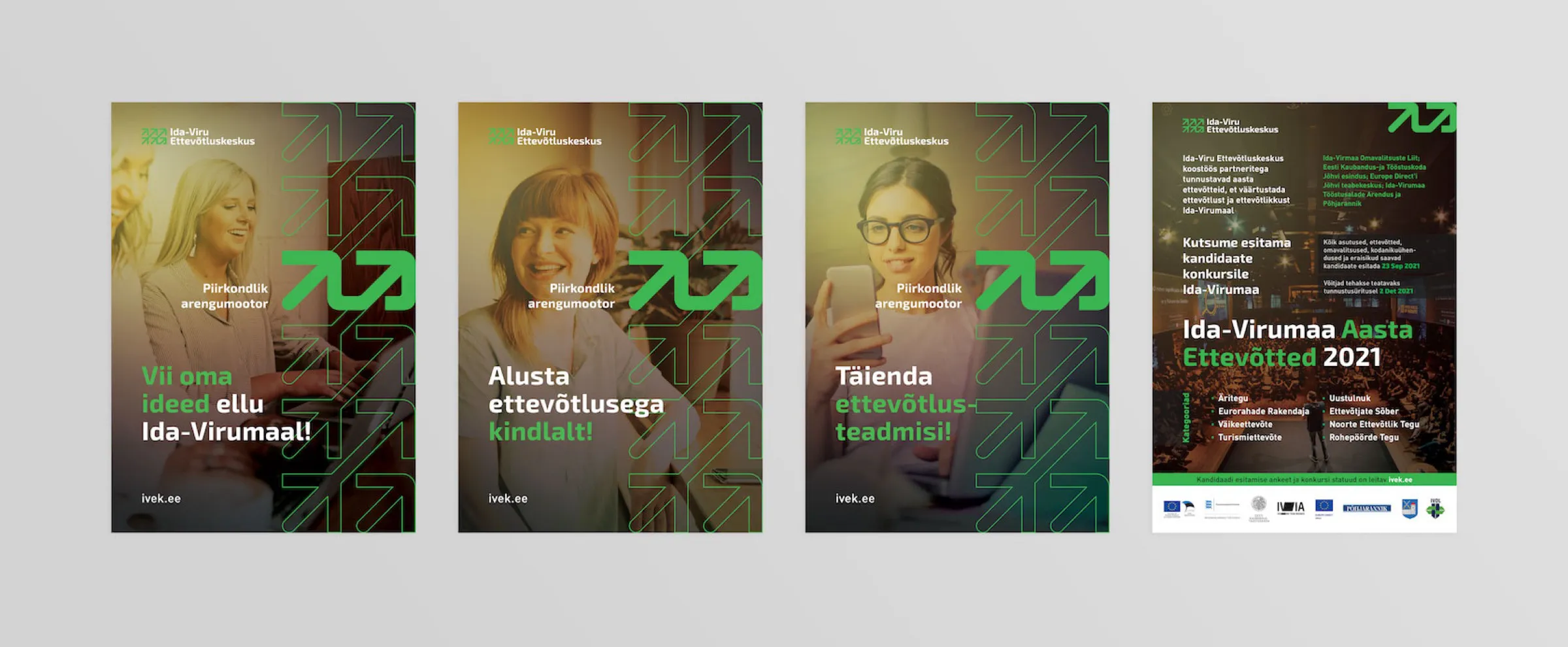
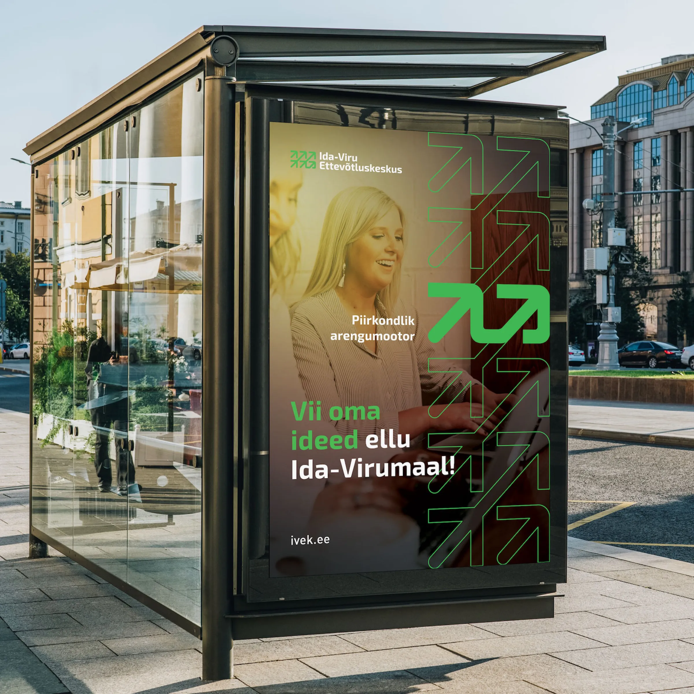
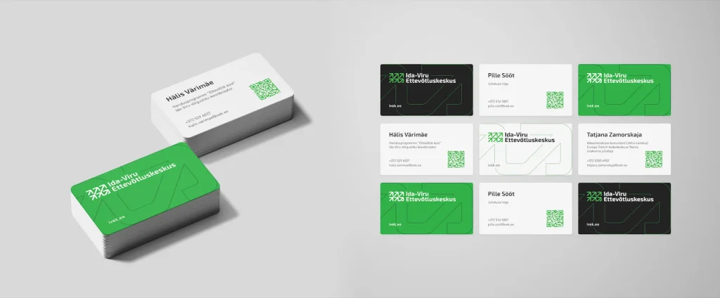
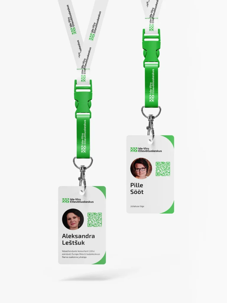
The logo that came out of this work is in fact a growth chart. Its x-axis stands for time and its y-axis for growth. The arrows on the chart are different kinds of companies: one starts from zero, while another had stalled before getting advice and is now beginning to rise again. In this way the mark tells the same story that people bring with them to the centre. The arrows became the graphic language of the whole identity, and they recur in the 29-page brand guidelines book, on business cards, staff ID cards, certificates and posters, and on the office signs and room numbers.
The name
For years the centre had been known by its abbreviation, IVEK. It is short and familiar to colleagues, but to someone who does not yet know the centre, four letters say nothing. So we agreed that from now on advertising would use only the centre’s full name, and the abbreviation would remain only in the web address ivek.ee.
Several languages are spoken in Ida-Viru County, so the logo was made in Estonian, Russian and English versions. The mark is the same in all three, and only the lettering changes.
Ettevõtluskeskus
Центр предпринимательства
Enterprise Center
Pattern
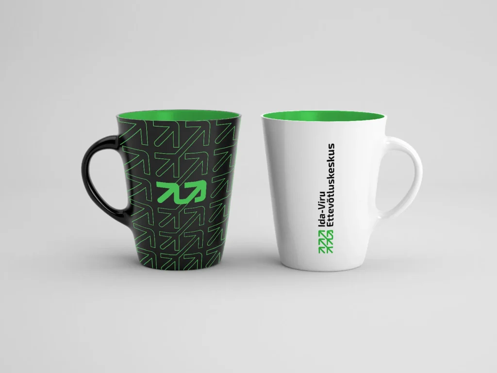
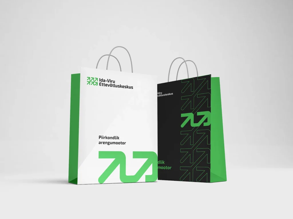
From the arrows of the logo we made a pattern that can be used as a full background or only in part, for example along the edge of a poster. It recurs on giveaways, bags and printed materials, and it keeps the centre’s materials in one line even when the logo itself is small or left out altogether.
Signage
On the office signs the arrow does what it was made for: it shows the way. The room number is large and clear, the name of the room is written in Estonian and English, and the arrow turns towards where you need to go. The signs are made from the same arrows as the logo, so the centre’s office speaks the same language as its posters and website.
- 4KontorOffice
- 510KoosolekuruumMeeting room
- 3.7KohvikCafe
- BPuhkealaRest zone
- VäljumineExit
The website
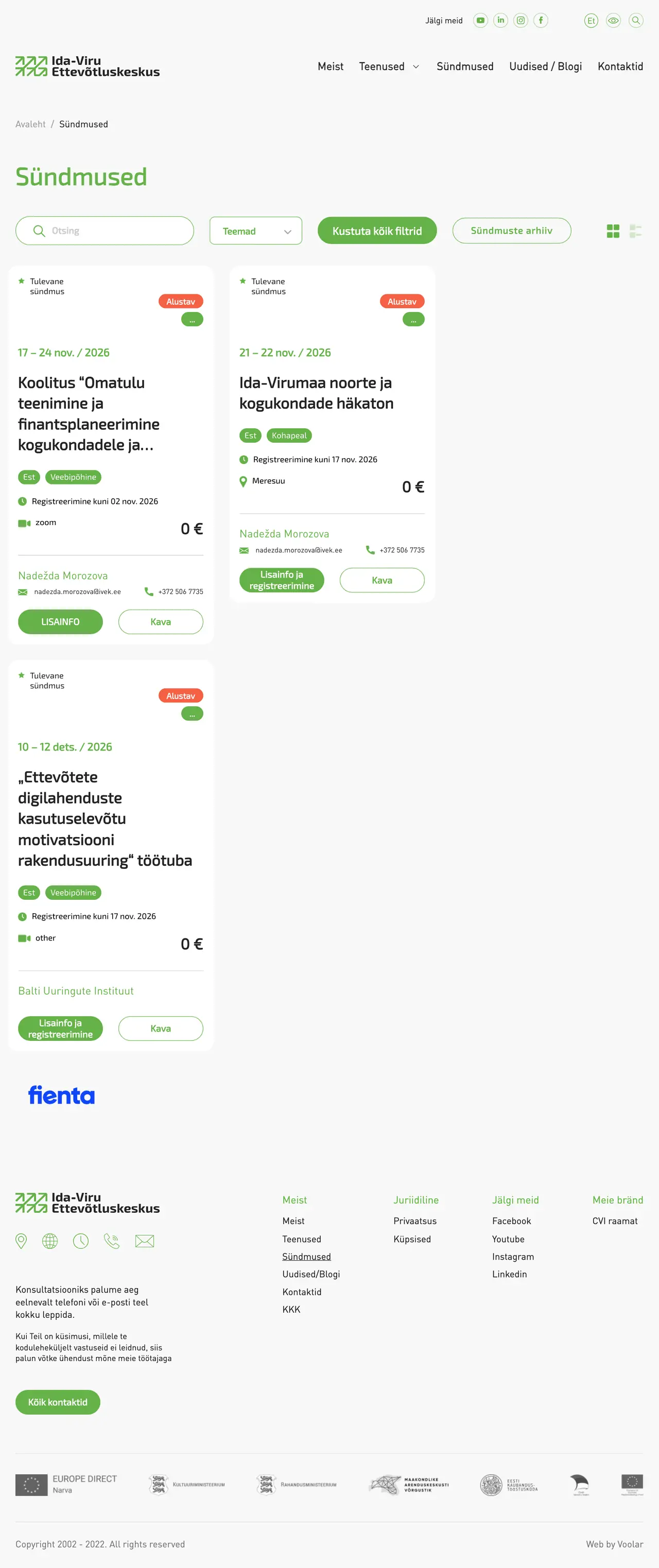
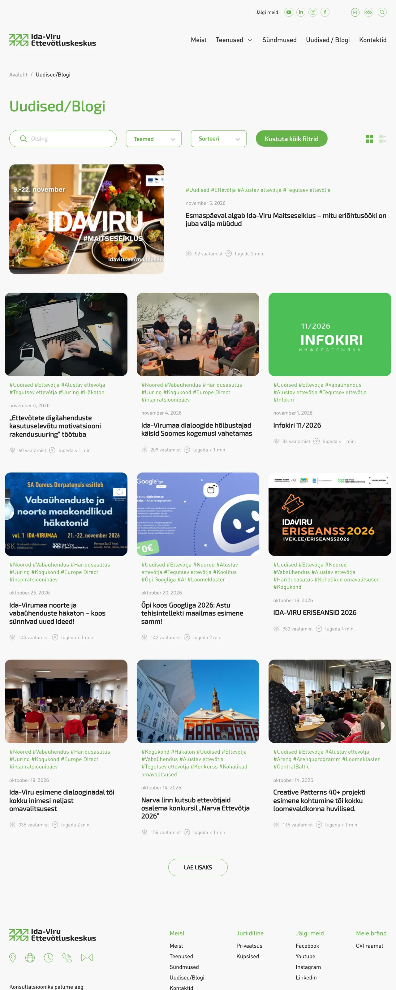
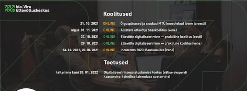
We built the website in the same way, starting from the people who use it. First we mapped out how different visitors move around the site and which page types were needed, and we tested this with real users. Based on their feedback we improved the structure, and then tested the finished design again on a computer, a tablet and a phone. Part of the content came over from the old website. Together with IVEK’s marketing manager Aleksandra, we gave both the old and the new content a clear structure, so that the pages have room to breathe. In size, the website is like a small news portal. To make it easy for the centre to manage, we programmed a number of our own content blocks into it, which let the team bring content to the fore in many different ways. We set the site up for search engines from the very beginning.
Finally, the centre’s Facebook and YouTube pages, its presentation template and its giveaways got the new look too. If your organisation also needs a face that people recognise, let’s talk.